Letterform Archive - an eclectic sample

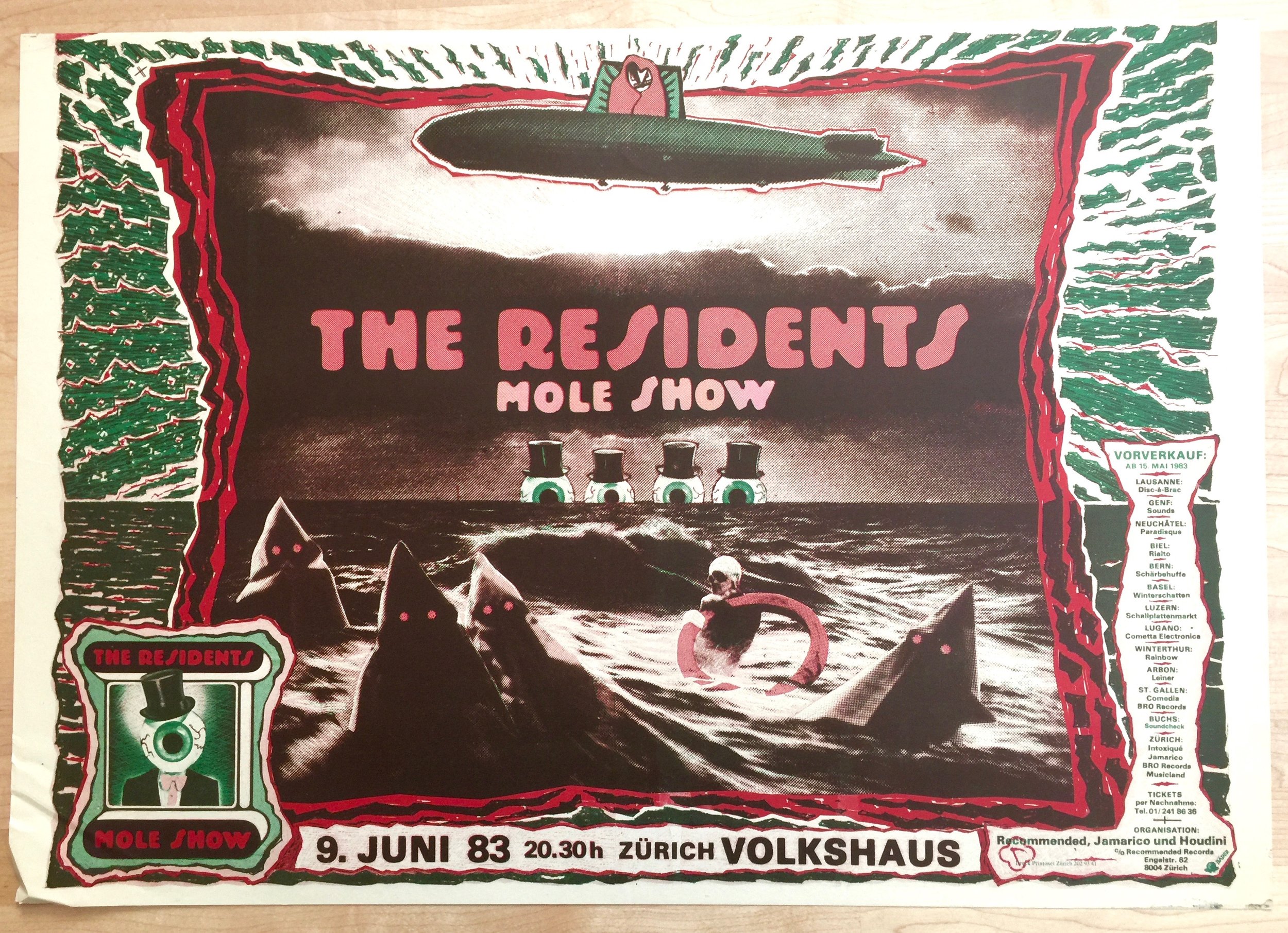
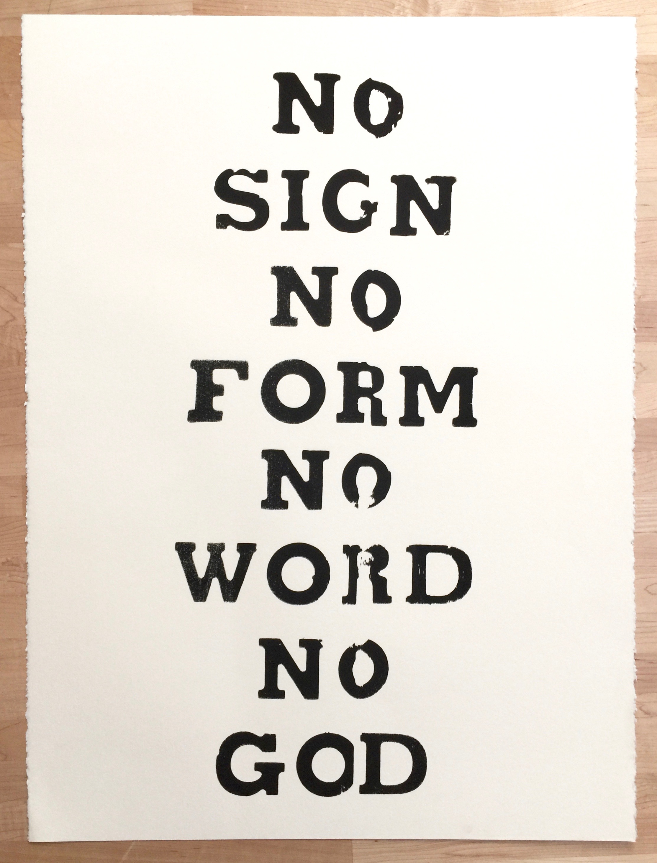
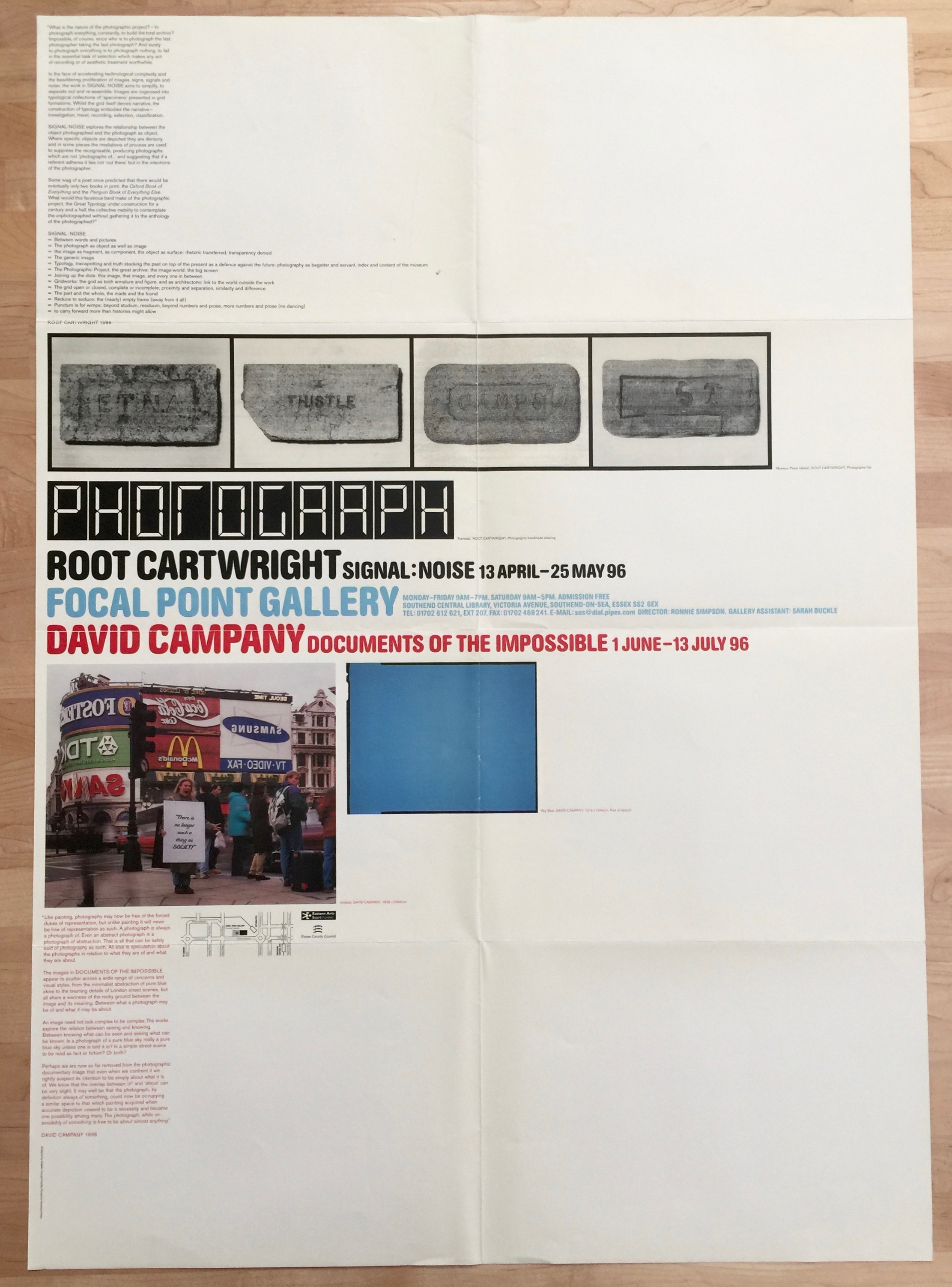
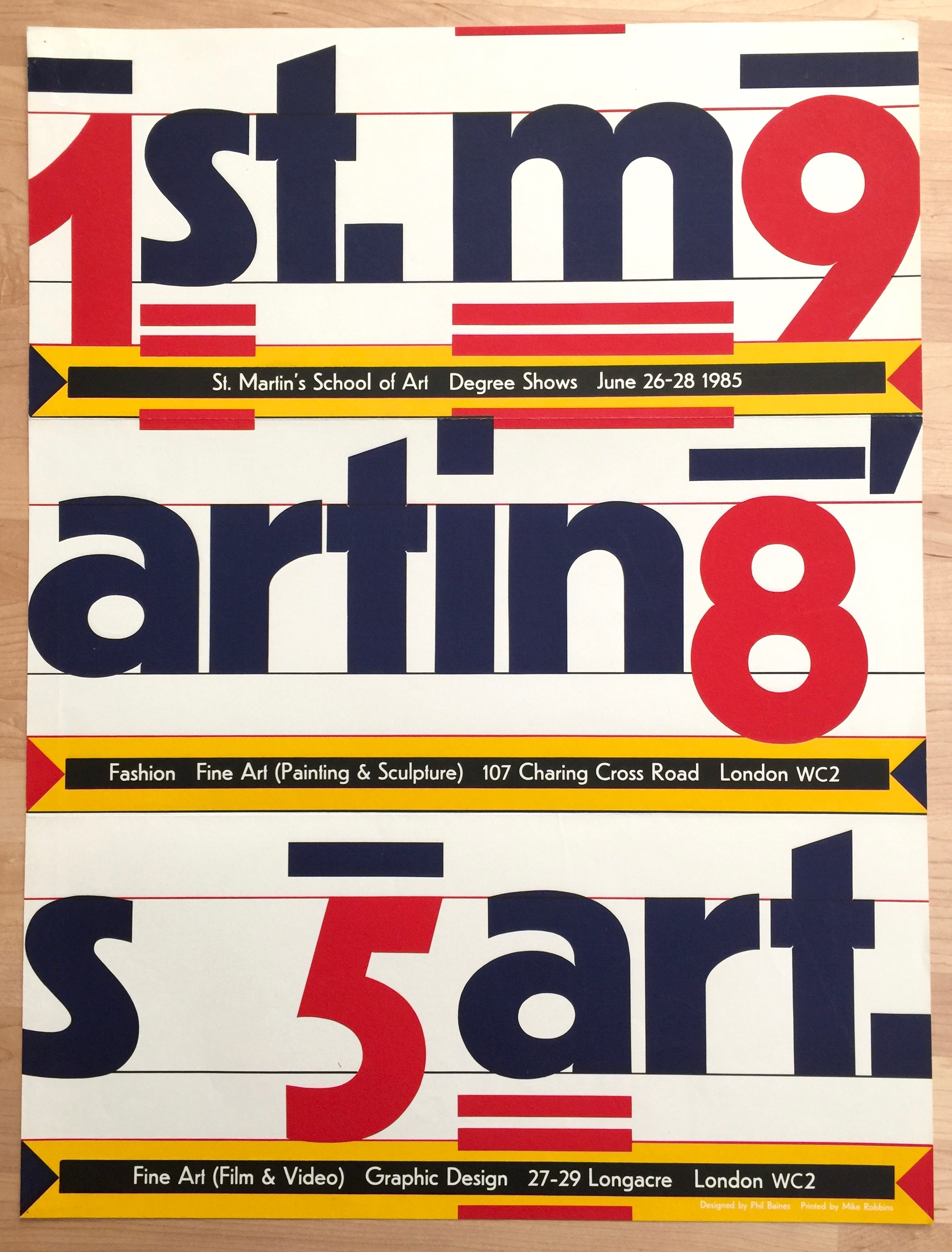
One of the things I love most about visiting the Letterform Archive is the impromptu discovery of awesome bits of design. You can book a research session with them and get a focussed deep dive into a particular subject area, but as a volunteer you just turn up and get stuck in. At one of my sessions Rudy VanderLans and Zuzana Licko from Emigré had just sent over a batch of posters and printed paraphernalia. Letterform Archive already has Emigré's archive including the digital development of the type faces, but this was a stack of items that they had been sent (by the looks of it back in the '90s). It was an amazing flashback to my time at art school. Here's a selection from the stack that includes the work of (amongst others) The Designers Republic, Phil Baines and Graphic Thought Facility. I particularly love the poster for The Residents gig in Zurich, not sure of the designer, Homer Flynn maybe?

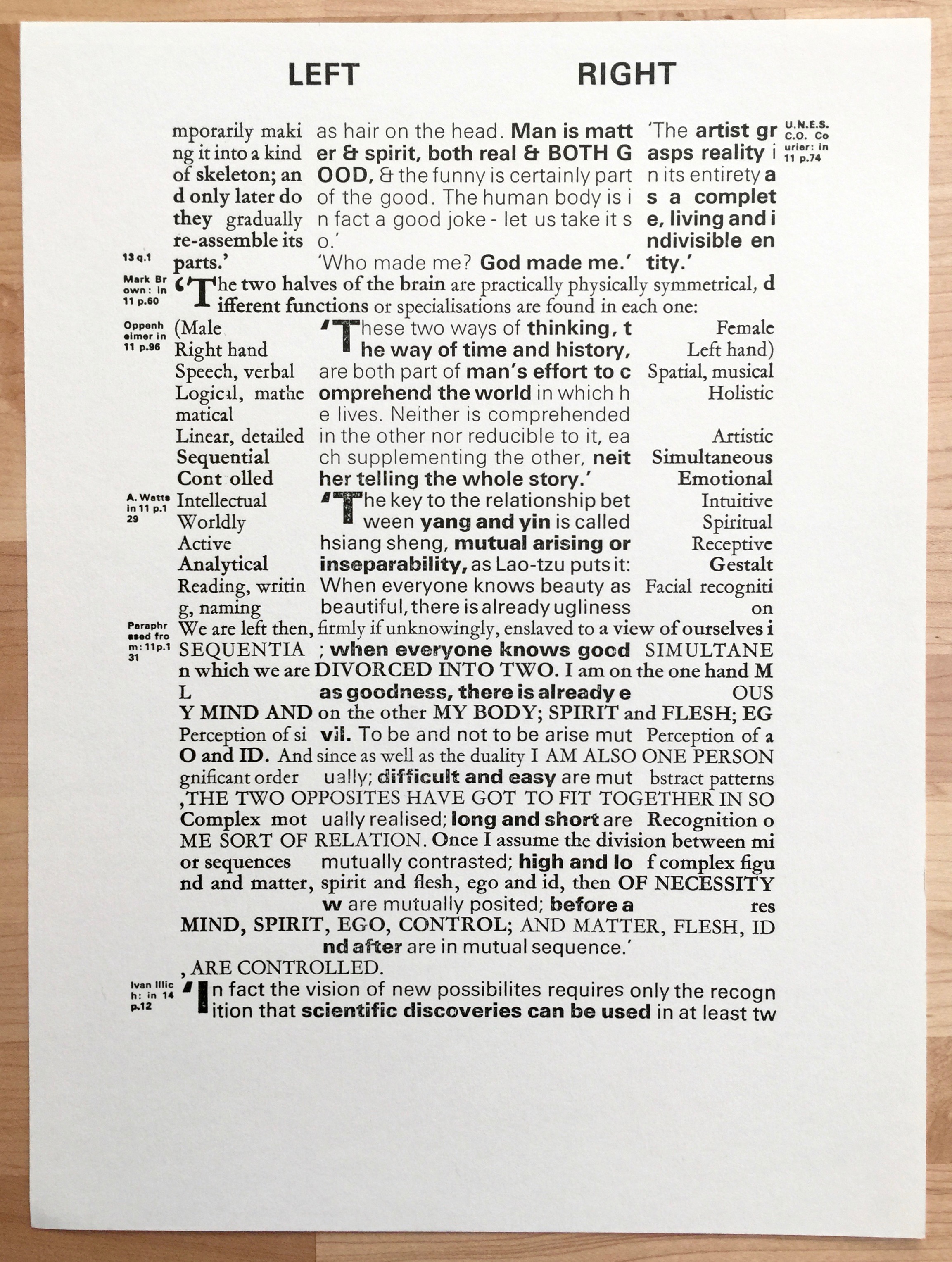
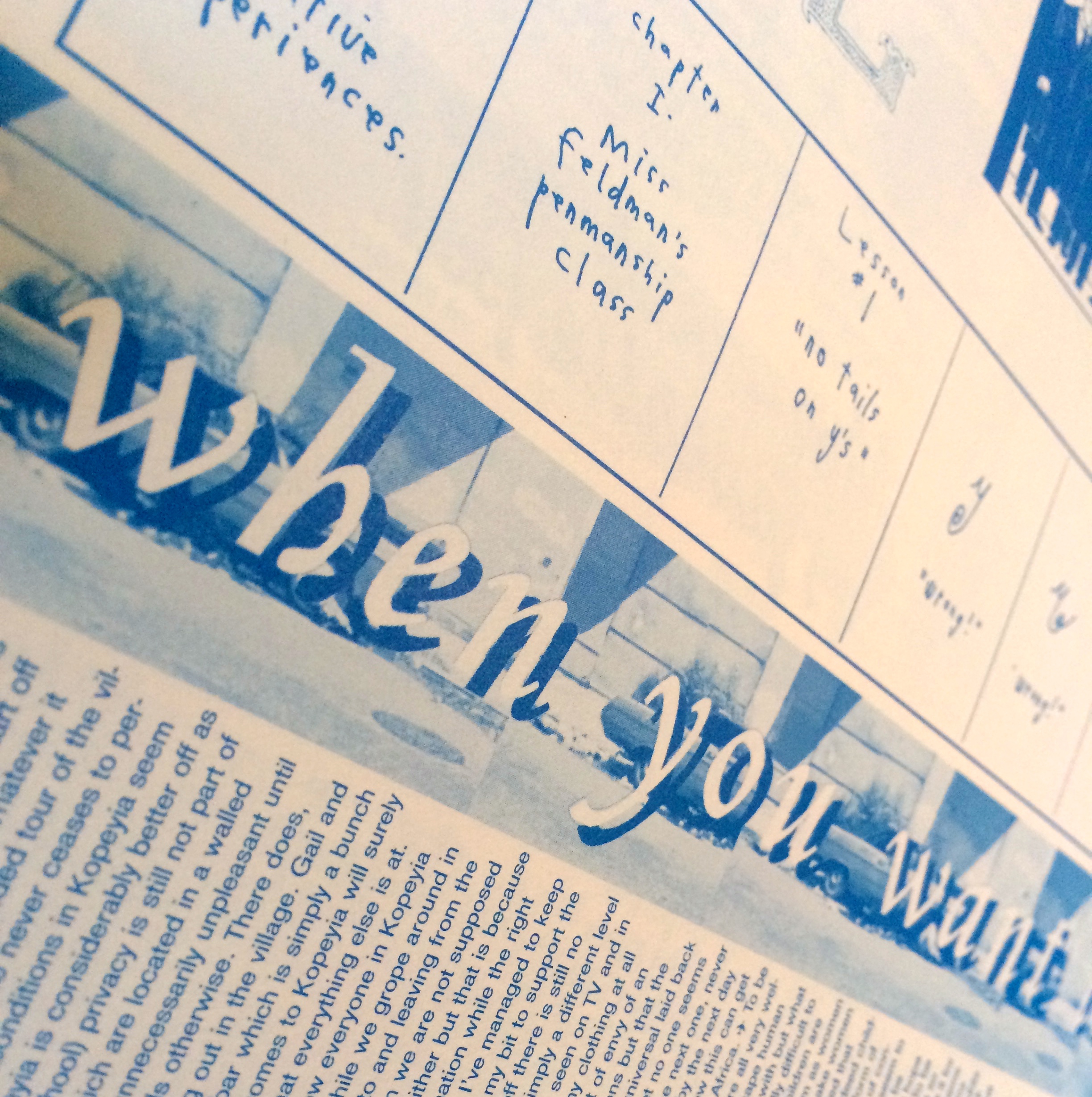
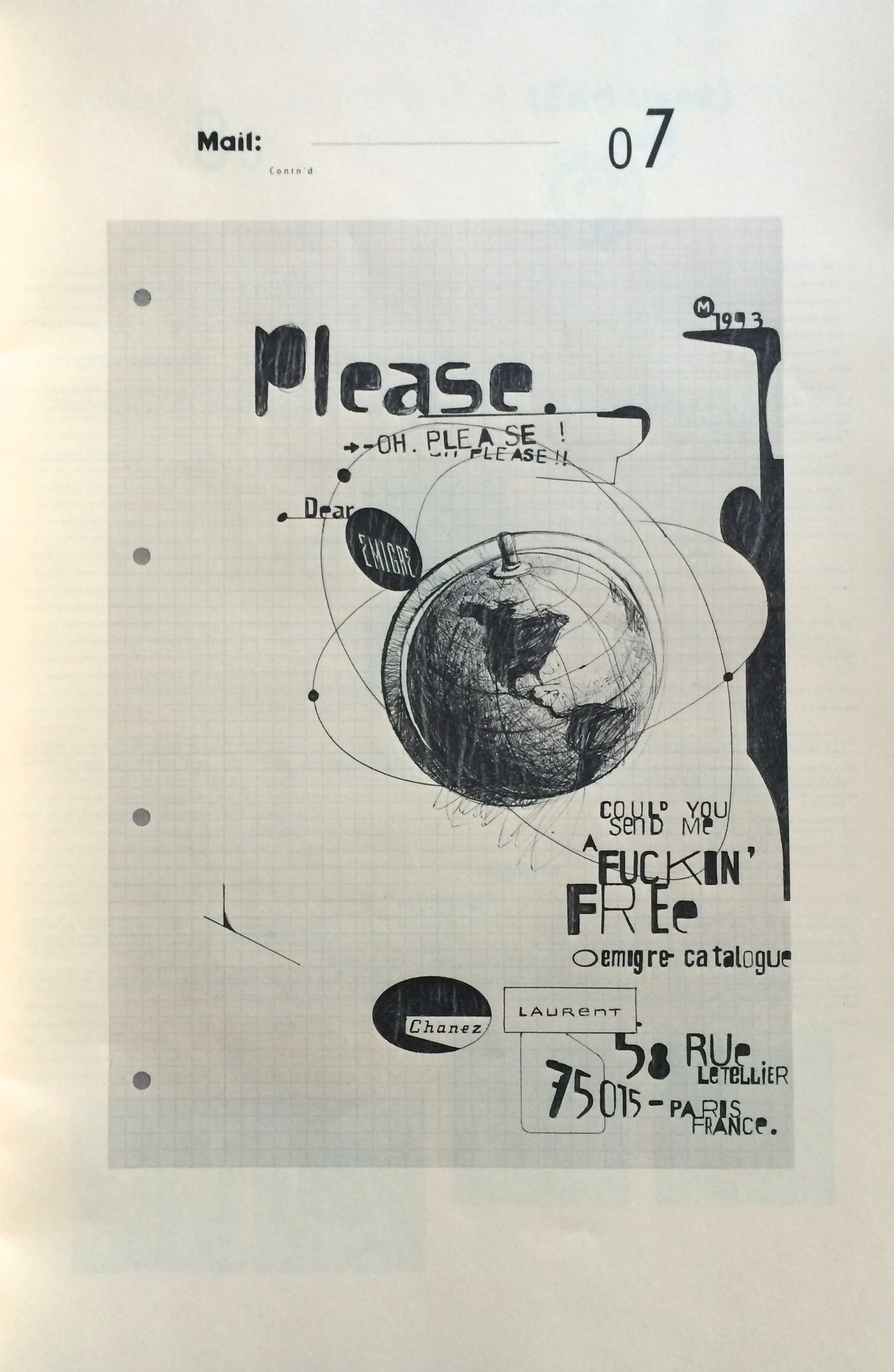
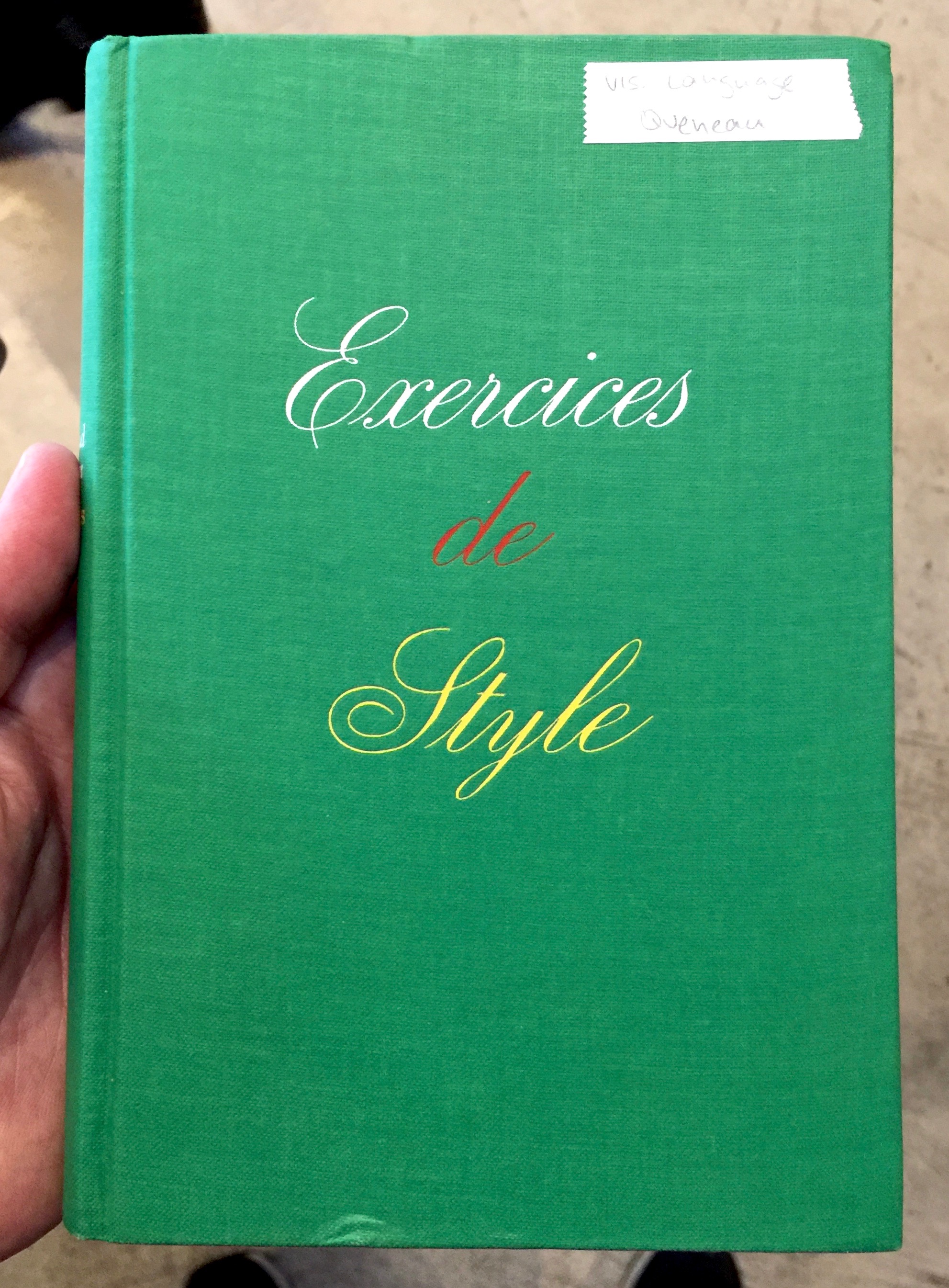
Although the eclectic nature of the archive is being filtered heavily through the things I love, it's still amazingly diverse. Here's a bunch of shots that include Raymond Queneau's Exercices de Style (see my copy here) and Cent Mille Milliards de Poèmes, dada letter art, type specimens and a few pics from the many, many design journals they have. 

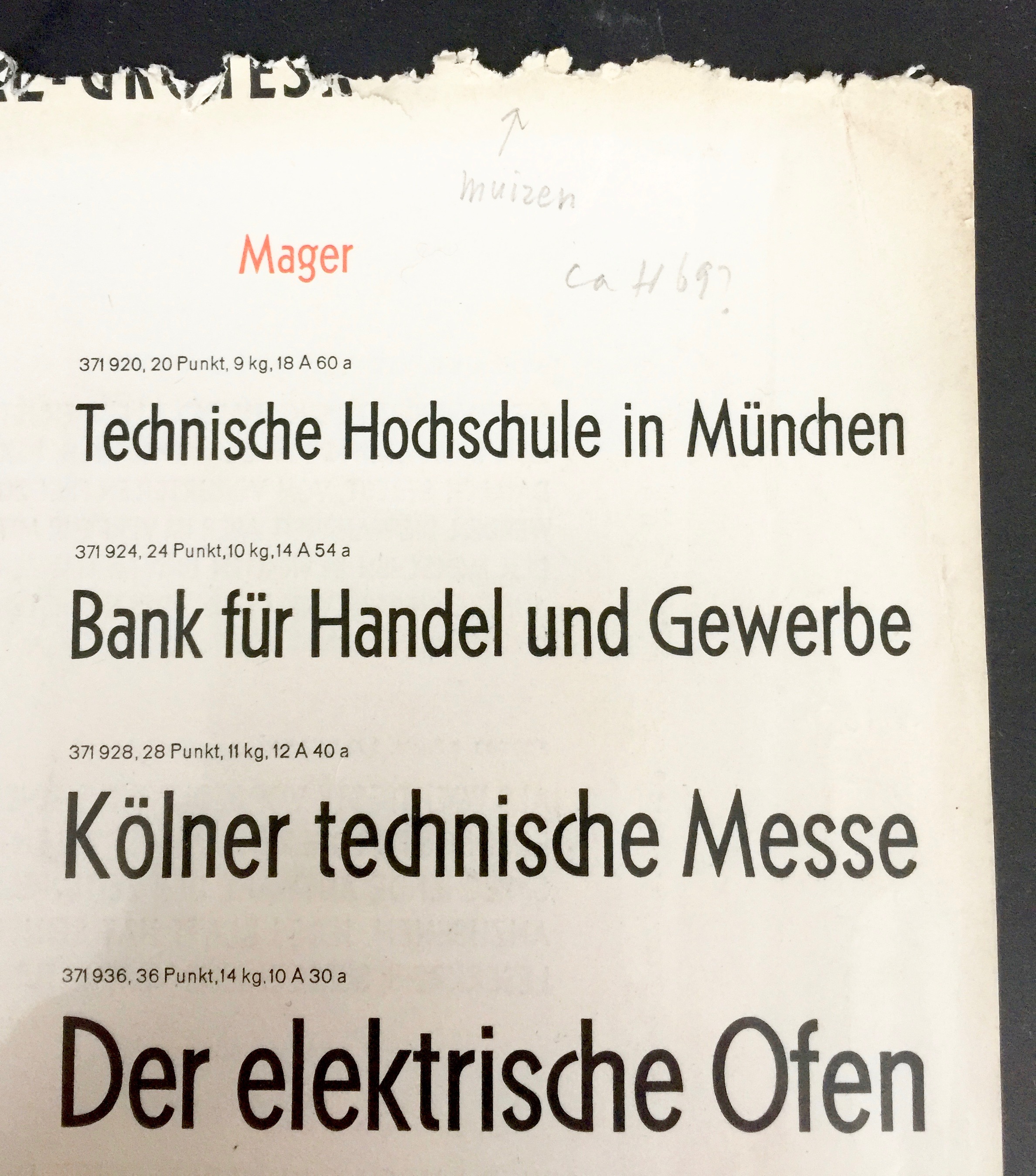
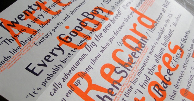
And this wonderful type specimen with the annotation in pencil explaining that the ragged top is the result of mice.

If you want to stay up to date with what the have join their 'Just in' mailing list: https://letterformarchive.org/this-just-in

Emigré the journal issues (33-49 bound)

I have a few loose issues of Emigré so when the bound volumes were released I had to grab them.

These are from the more theoretically engaged period, epitomised by the mouthpiece series. Great to look back on and see the issues that raged and in many cases are still raging, it's like a graphic design time capsule - awesome.

And here's a bunch of close ups.

http://www.emigre.com/

Issue 26 of Emigré magazine

This is one of the later issues (No. 26 Spring 1993) of Emigré that was published in the large format. Fairly soon after this it went to a smaller journal like publication. Interestingly this coincided with a shift in graphic design writing. A move away from pure design expressions and visual exuberance to critical theory and the rapid intellectualising of graphic design. The digital revolution was in full swing and digital type and challenging the traditional rules was the norm. Endless debates raged about legibility and the 'cult of the ugly' and we had a new set of design superstars such as David Carson (End of Print was published 1995). It was an interesting time to be a design student.

The large format versions reflect the visual heyday of Emigré and most of the items in this earlier post are from that period. They focus on the design practice and artefacts rather than the discourse - they don't ignore the debates, rather they are about showing them, not waxing lyrically upon them. The smaller format editions cover the design debates in a more writerly fashion, a more traditional journal. It was a period when graphic designers were very actively and intellectually engaged with their work and it's impact. I have the bound volumes from the small journal (issues 33-49) and will post about them some time in the near future.

Dot Dot Dot magazine

This is Dot Dot Dot or ... or maybe even ellipsis. It's the first issue of a graphic design journal started in 2000 that ran until January 2011. It was the brainchild of Peter Biľak and Stuart Bailey and as Peter puts it, it was an "after-hours magazine, originally centred around graphic design, later broadening in scope to interdisciplinary journalism" more here on Peter's site.

This first addition has an introduction by Max Bruinsma and is linked the Jan van Eyck Akademie, Maastrict. A school that had some interesting people and programmes, especially around socially aware design and the European ideal. This issue is almost a meta discourse as it concentrates on Graphic Design Journals, featuring pieces on Emigré, Eye, Form + Zweck and Octavo. I particularly like the 'Encyclopædia of Graphic Design Periodicals' which is also featured on the back cover.

Here's a link to an excellent new magazine from Peter Bil'ak: Works That Work Magazine