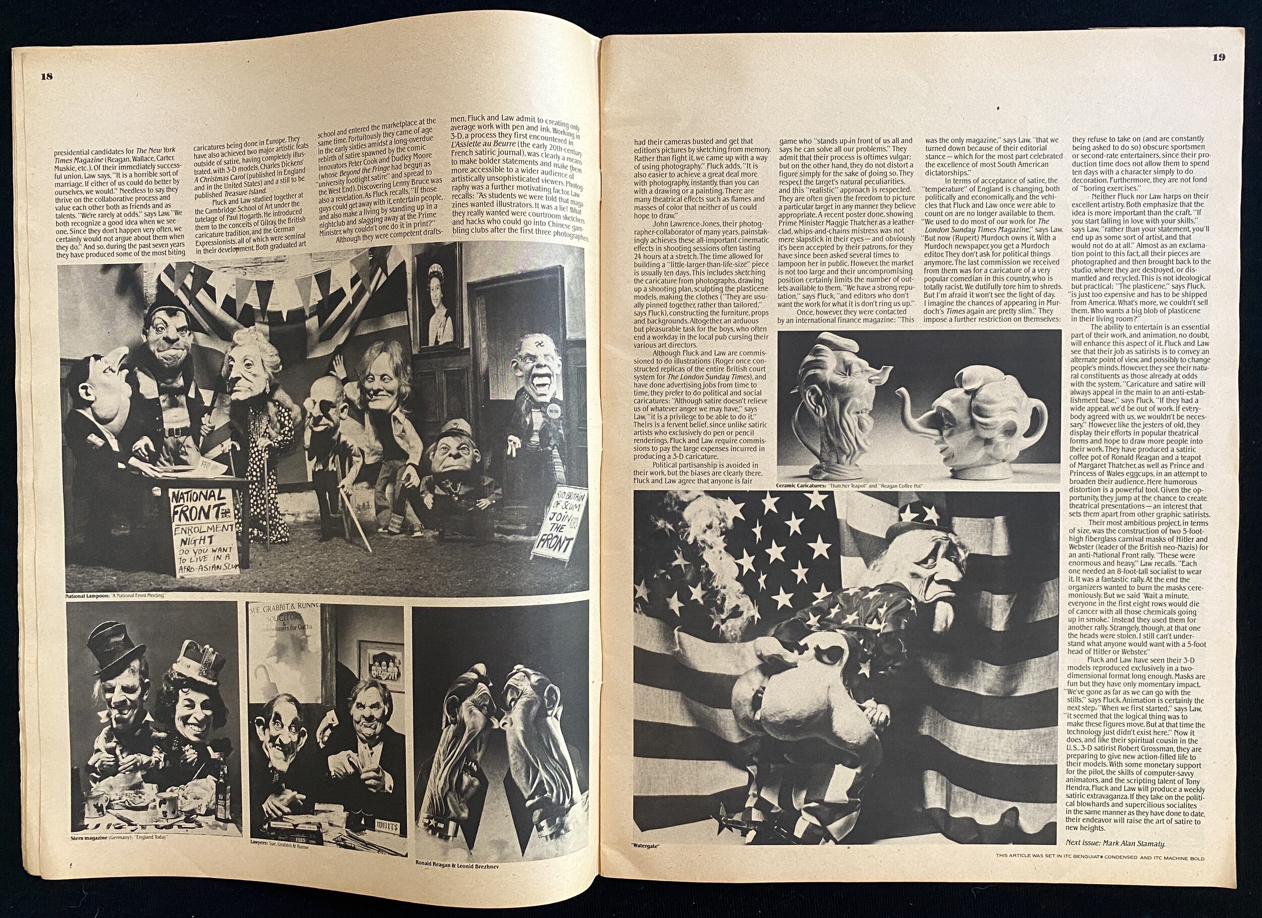
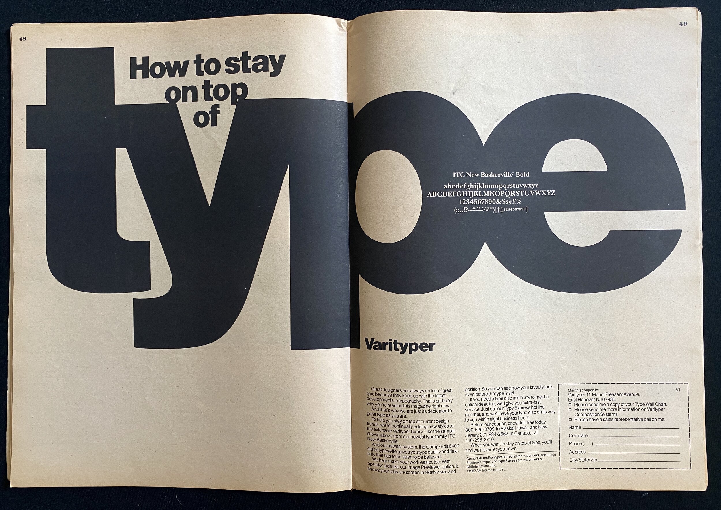
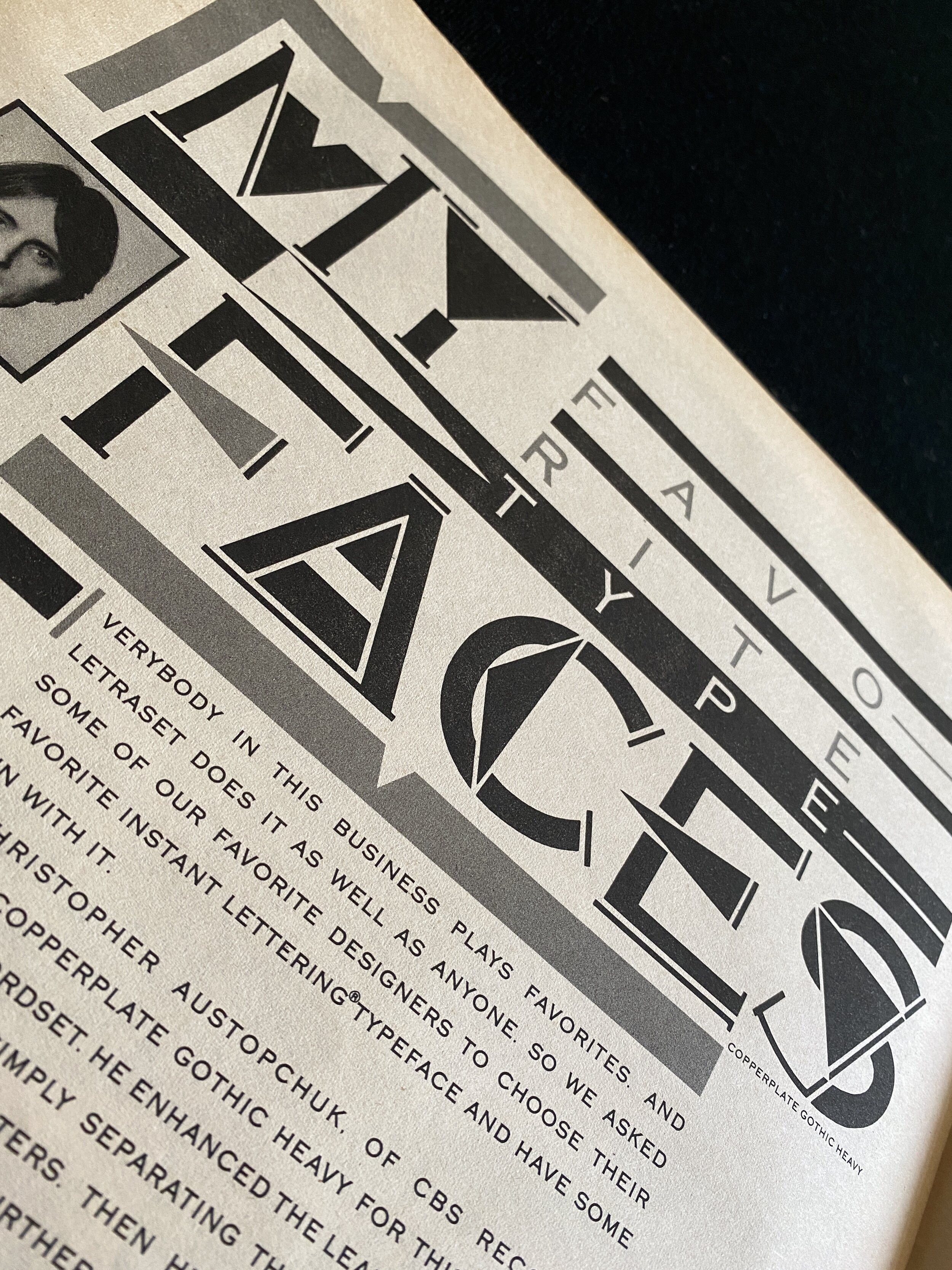
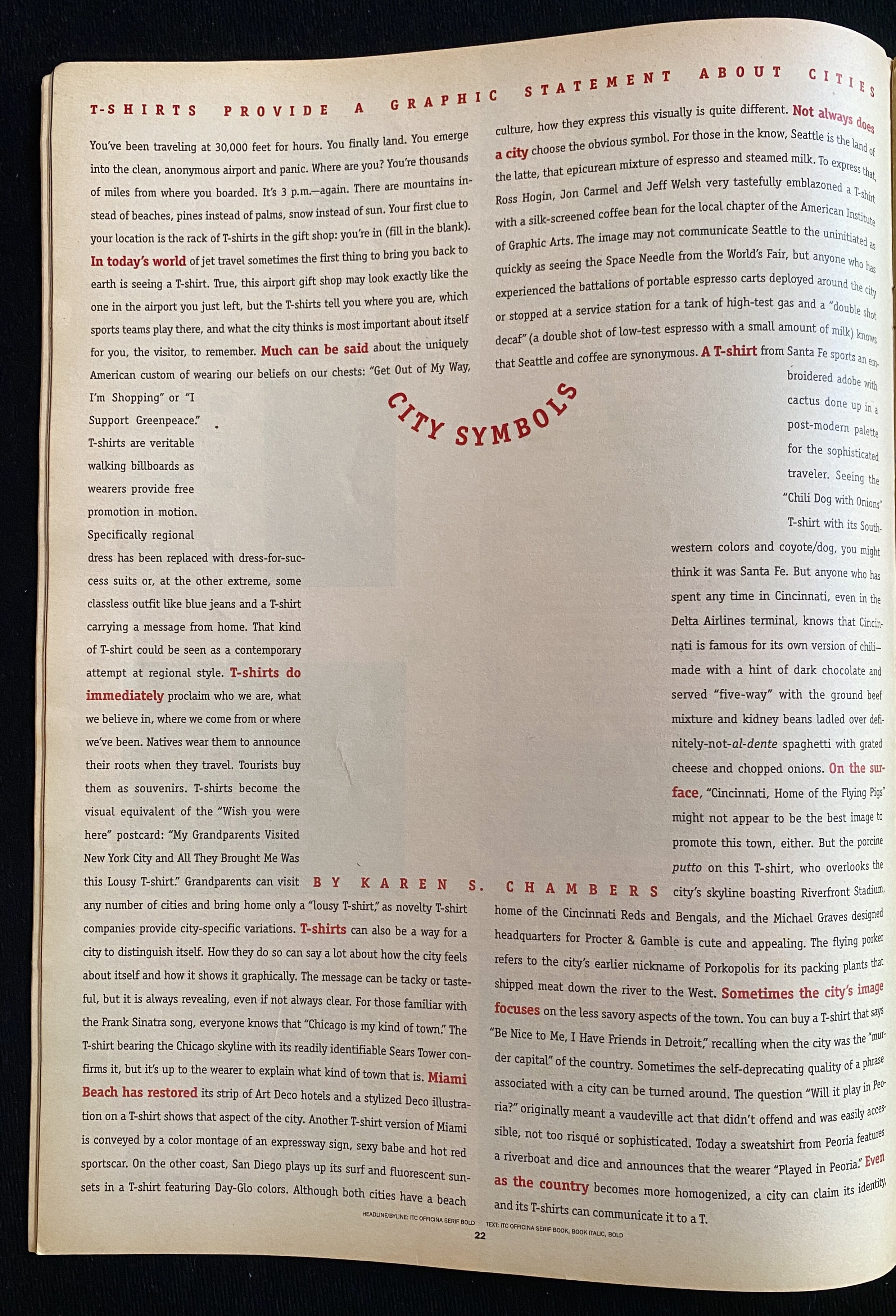
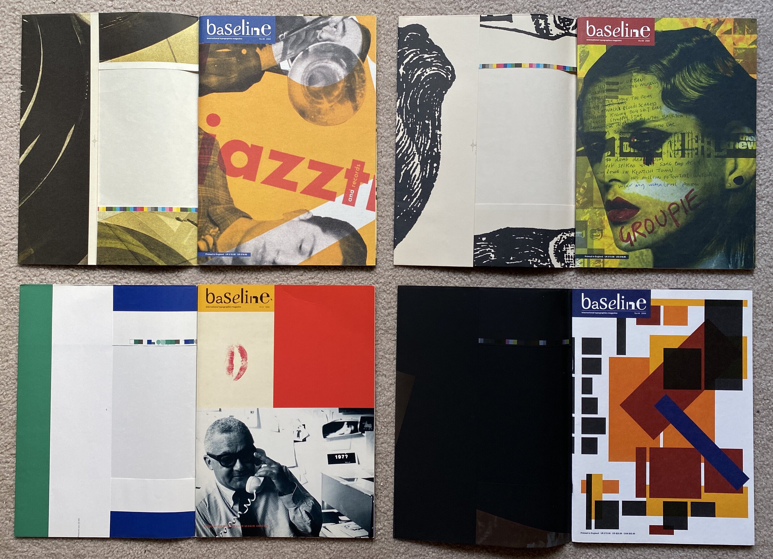
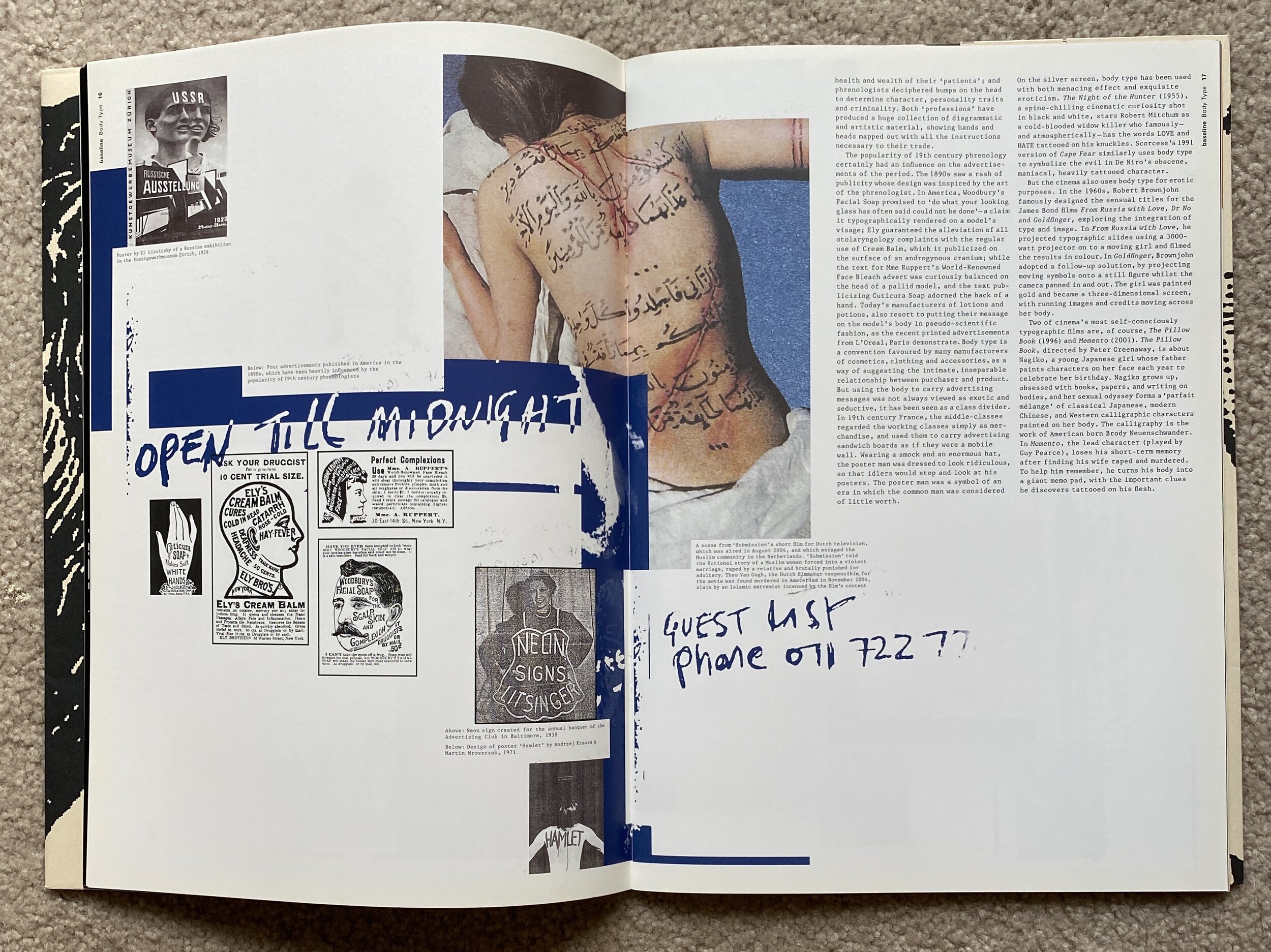
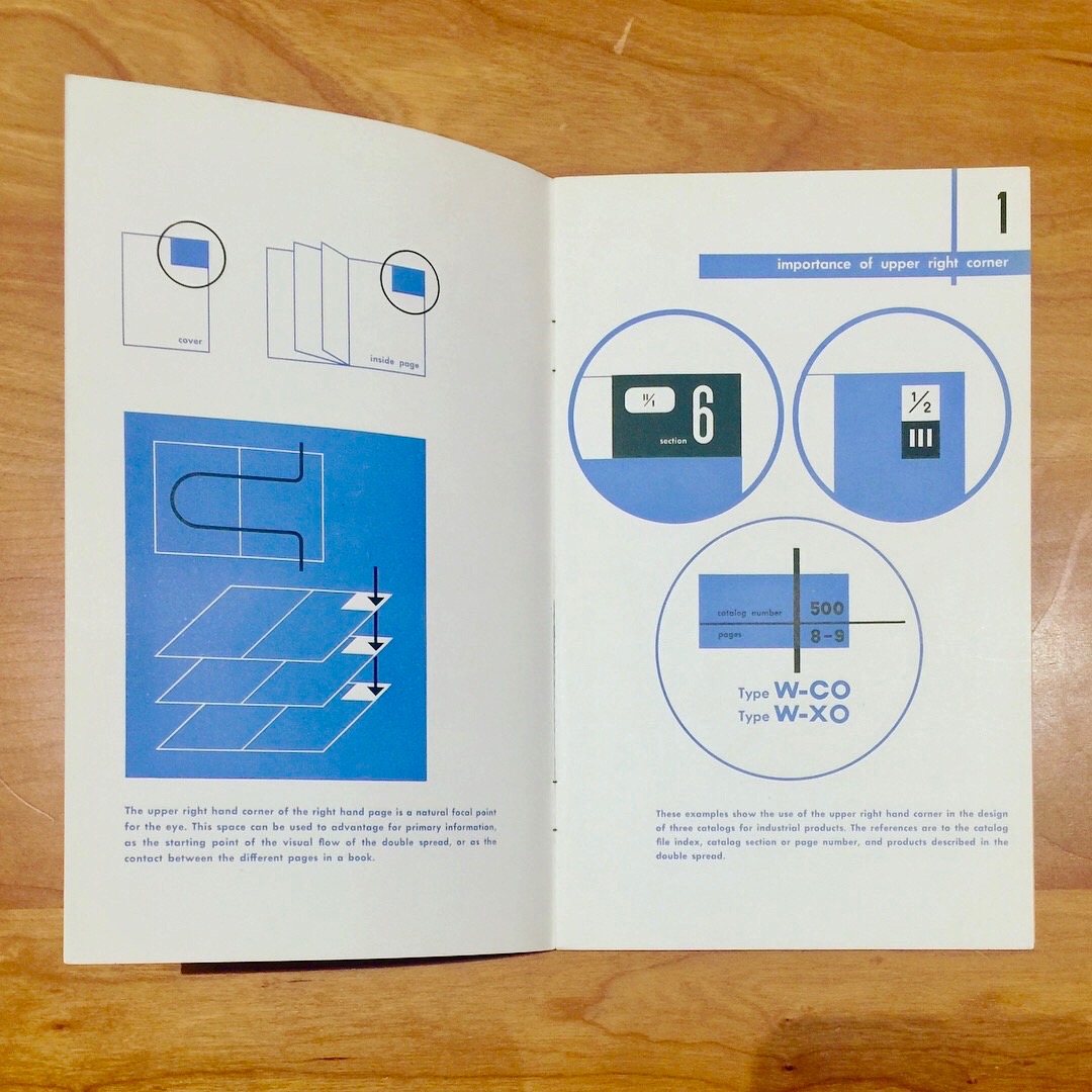
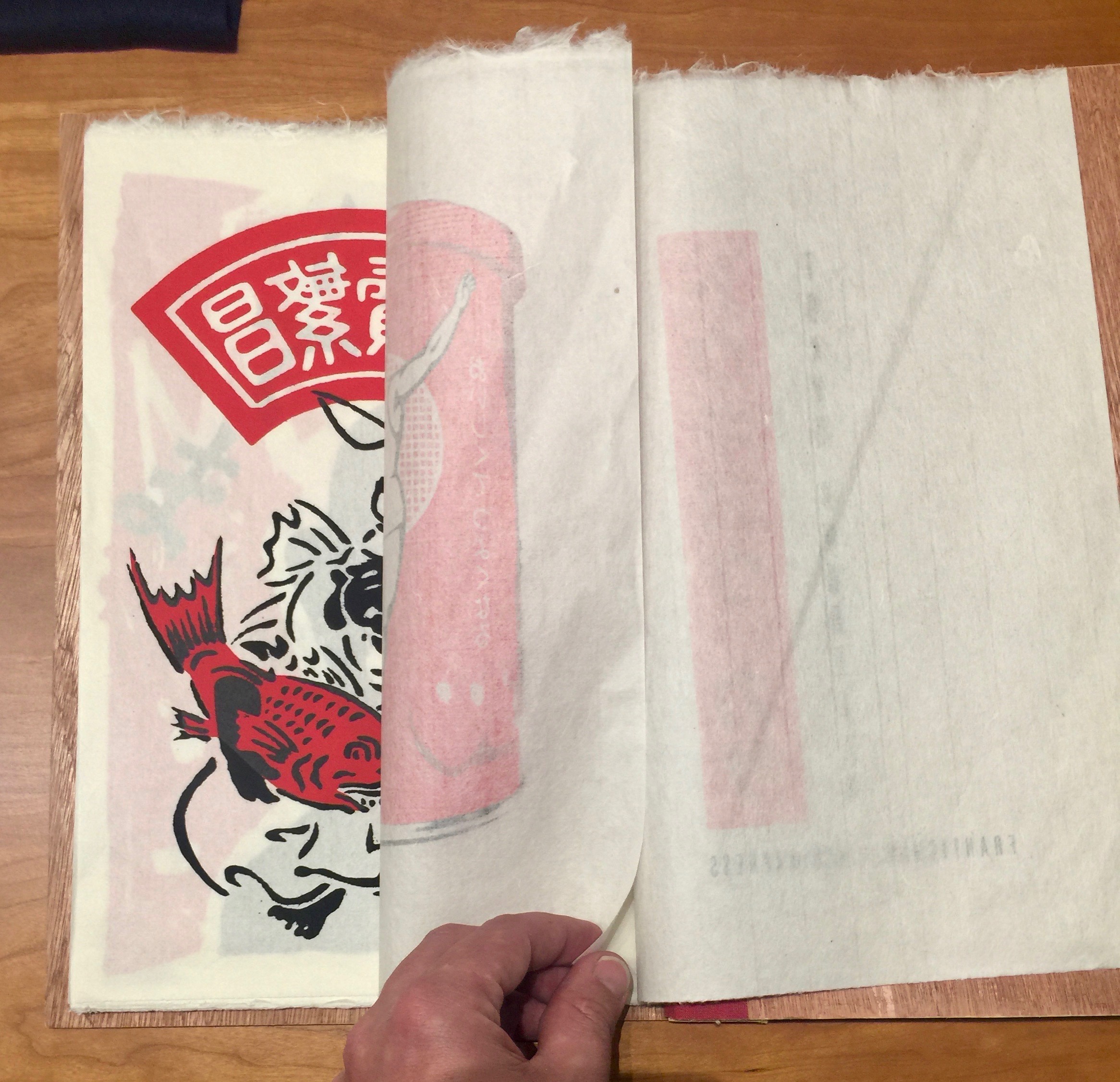
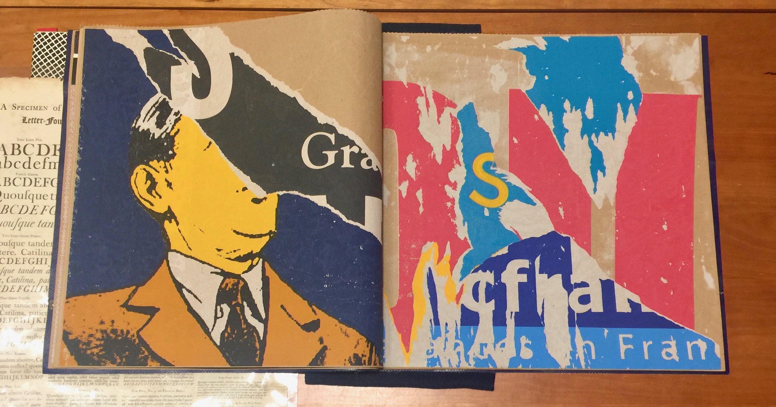
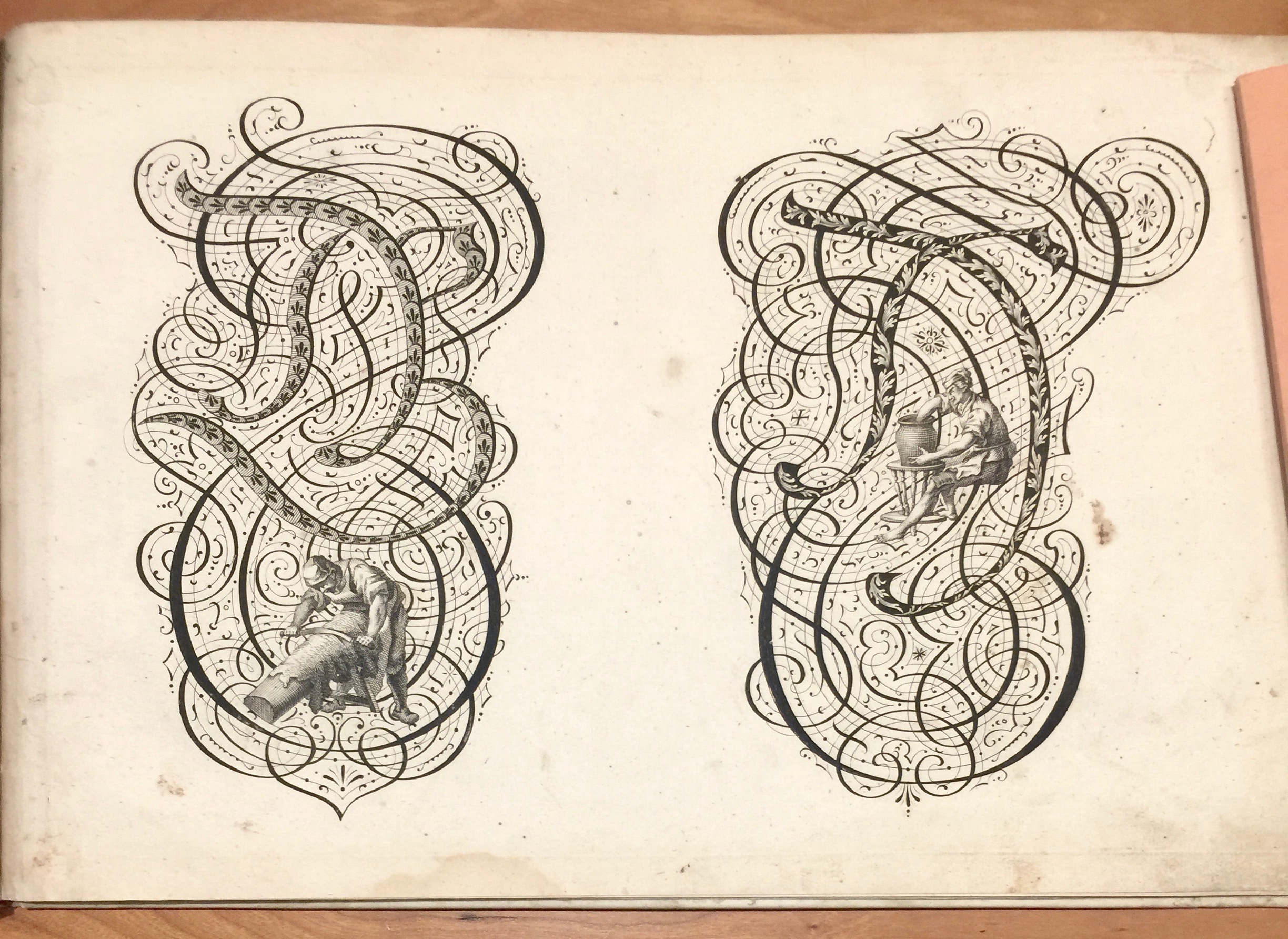
As promised here are a few pics from the copies of U&lc. that I picked up a few weeks back.
I always had mixed feelings as student when I leafed through U&lc. The covers and size promised so much but often it didn’t deliver (at least for the style/idea hungry design student I was back then). Probably because it was ultimately a trade rag (back then - early 90s, all I wanted was to get hold of Emigre or Form und Zweck). For me it often felt like the graphic design ‘establishment’.
However there were always moments and exceptions which meant I kept going back to the Art College library and picking up. Looking back over this sampling of 12 issues between 1982 and 1994 I’m struck by the type ads, the editorial content and the illustrative focus (which I’ve mostly left out of the pics - sorry). In the same way the Penrose is a time capsule so are these - and as with the Penrose, it’s about the trade as it was, and not so much about the possibility of what it might become.
Due to the scale there’s a lot of ‘lets make the type really big’ - which can be great but also leads to the feeling of emptiness I get.
There’s a lot about ‘digital’ and plenty of very 80s looking things.
Don’t get me wrong, I’m very glad I picked these up, so many interesting and wonderful touches and such a pivotal part of graphic design history. In the pics above there’s a piece on Tiffany lamps set in the oh so 80s (at least to me) ITC Tiffany Heavy. The piece on t-shirts above with the lovely ‘city symbols’ touch reminded me of something Neville Brody said (on TV) at the time - “no ones says anything anymore, we just print it our our t-shirts” (badly remembered/paraphrased by me).


