
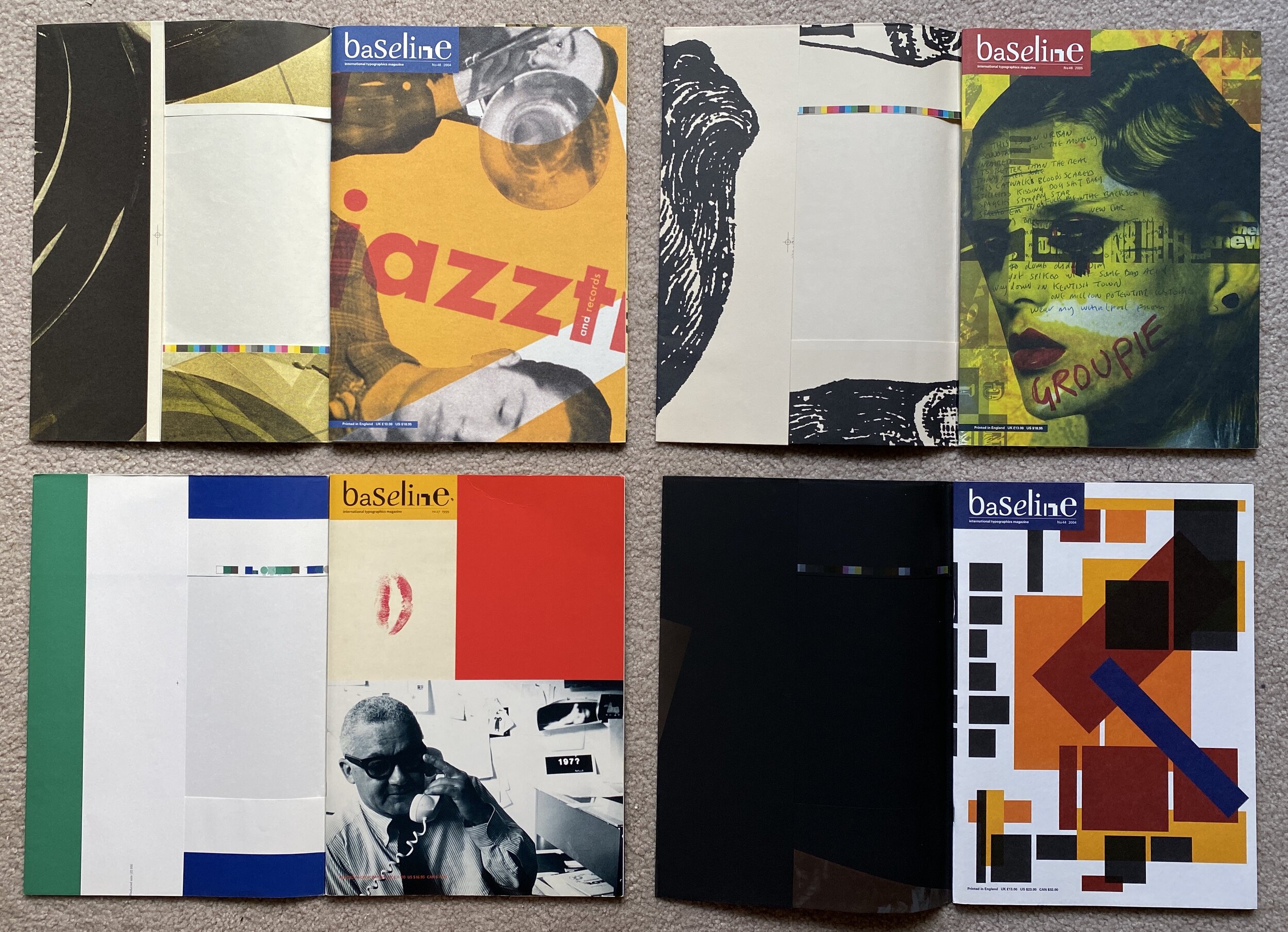
I was digging through my library and found four issues of Baseline. I’d forgotten how good it was! The issues are from 1999, 2004 and 2 from 2005 (# 27, 44, 46, 48) and all have ‘poster’ cover wraps which make them feel oh-so-special.
Looking back on them there’s so much to love (which I think I missed back then). The larger format gives the designers lots of space to play with, and they aren’t afraid of white space either! It’s also way quirkier than I remembered.


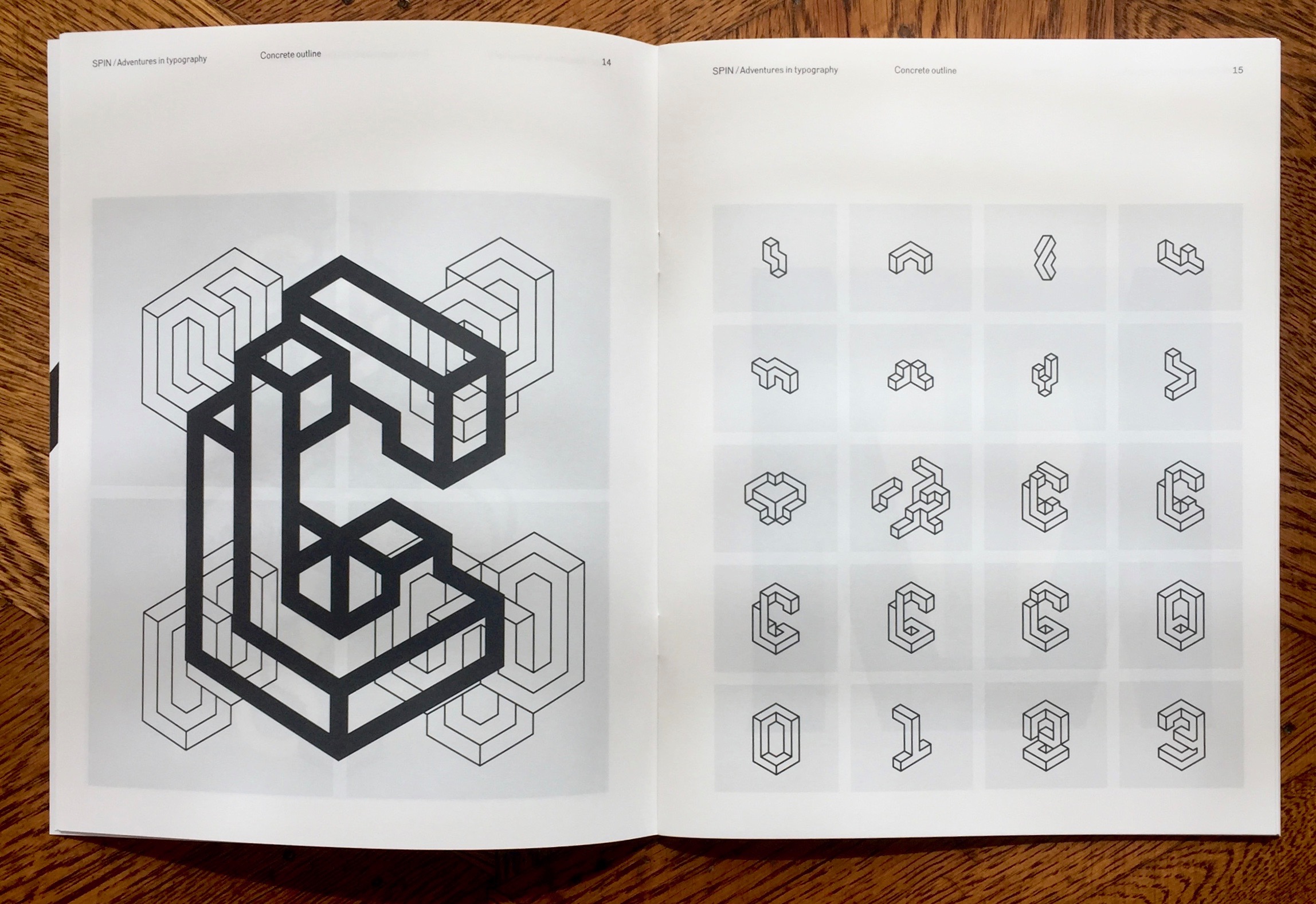
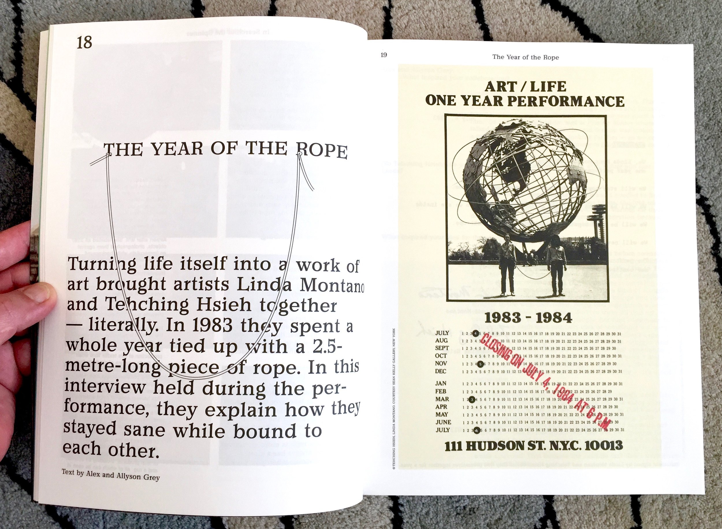
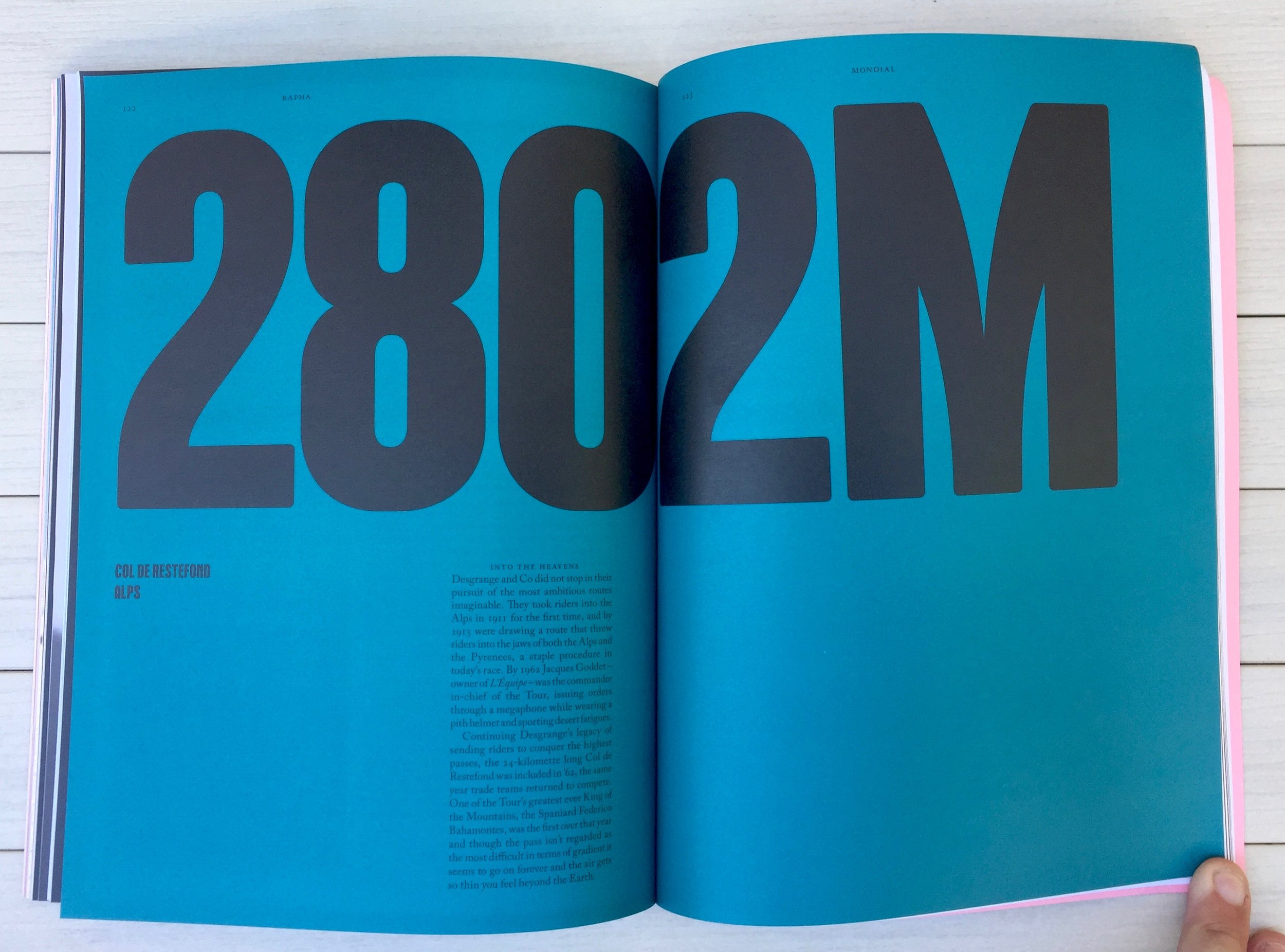
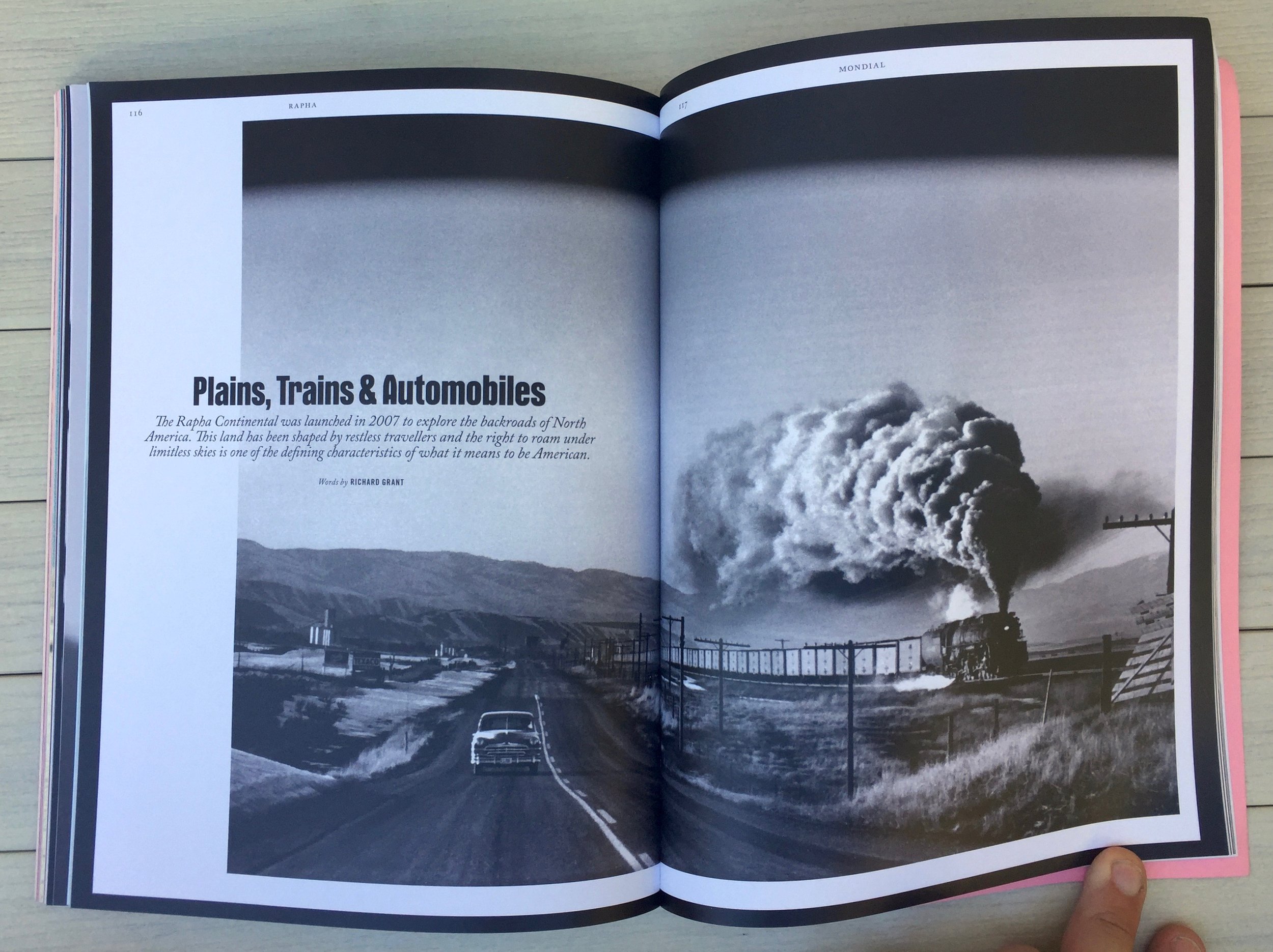
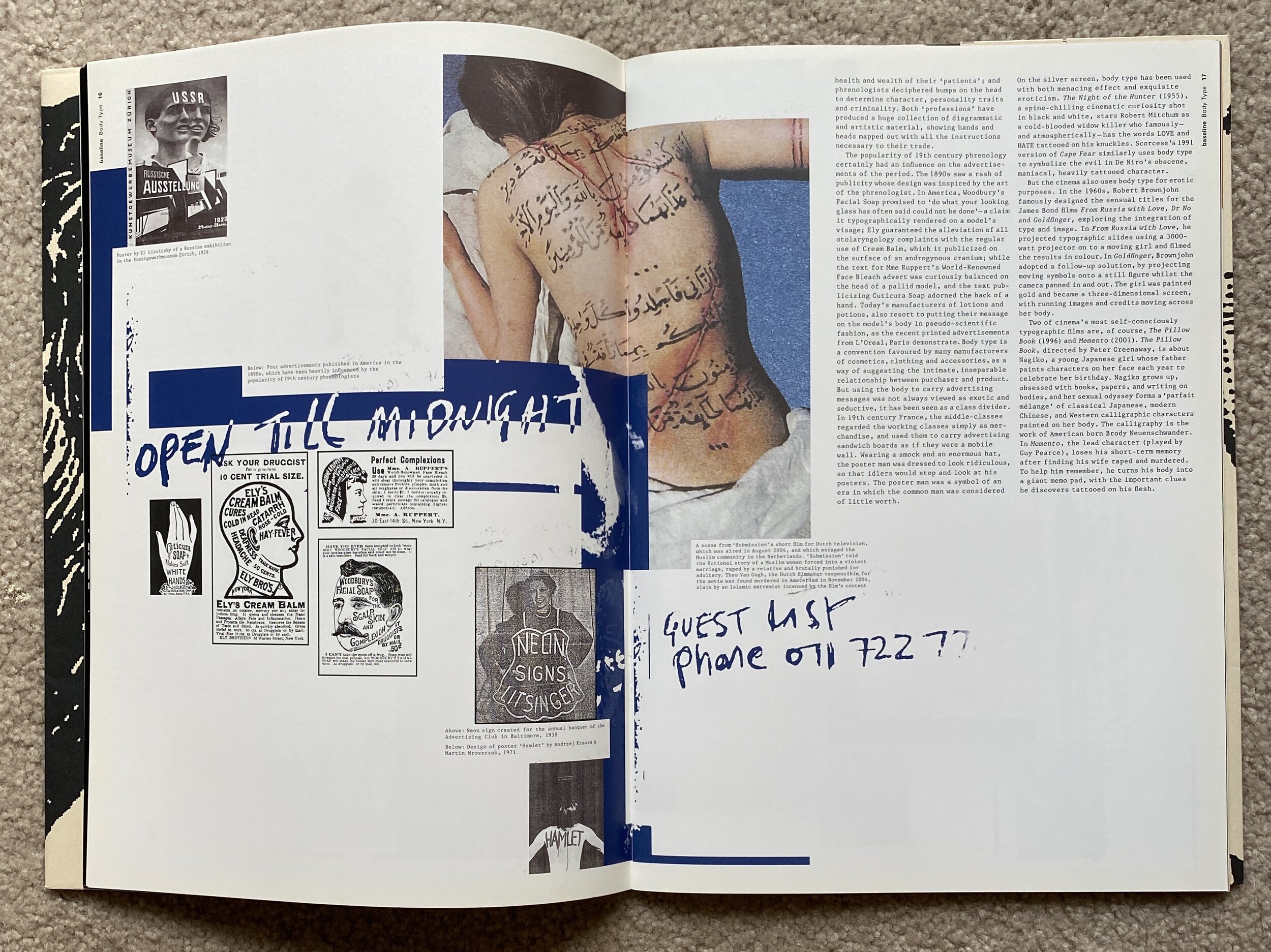
Below are a selection of spreads from them. One of the most noticeable things is the proportion of text on the page. It’s tiny. Admittedly the small font and large page real estate is a factor but still. It’s way more a visual canvas than a journal. The grid is always evident even in the experimental pages or when they switch an article to landscape - which I really hate (sorry, I know, it changes pace, interrupts reader, forces new perspective, but I hate the switch mid mag).


These article lead pages are so gorgeous and at this scale pretty luxurious.


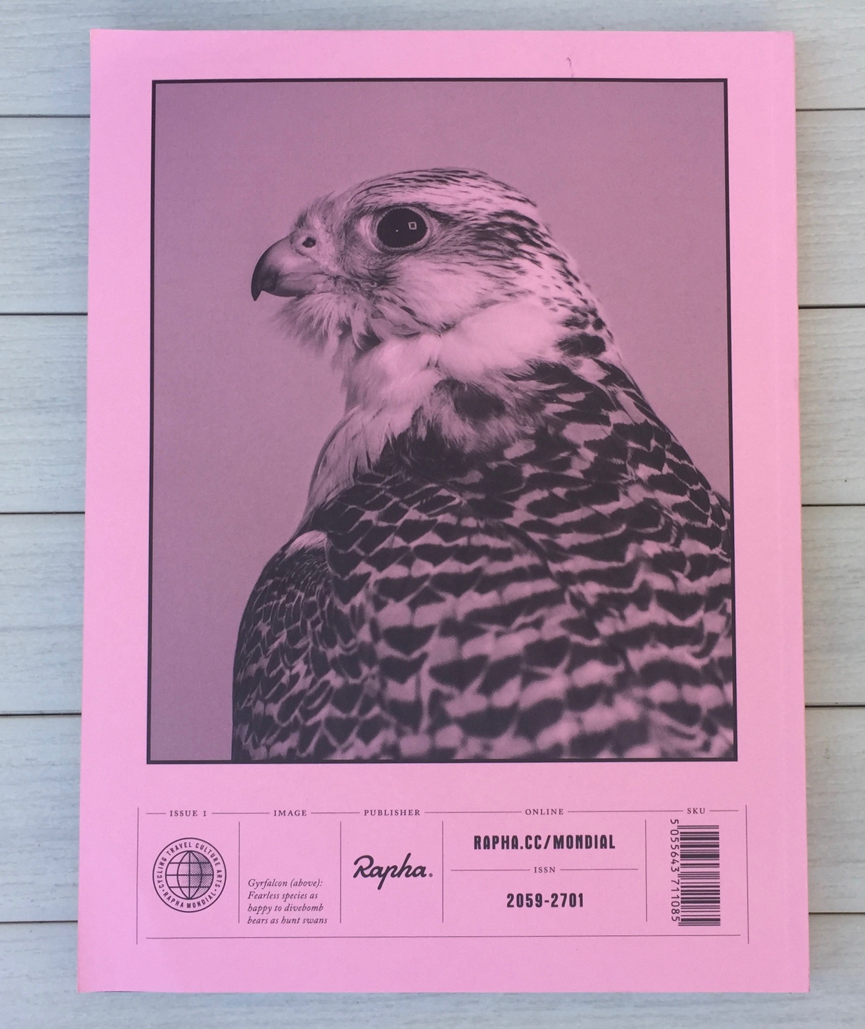
The face below is the poster cover wrap of issue 48 (designed by HDR Visual Communication). That issue also has the layout gem below where the illustration breaks not only the grid but also the page. Lovely touch but registration must have been fun.


Here’s a link to the online Issue Index - looks like it covers all issues to No 63 (1979-2018)