I’ve had this a while and finally gotten around to posting it. Mostly because there’s so much of it! AZTDR or A-Z of The Designers Republic is a vast body of work from the Sheffield duo. Chocked full of commercial, personal, political, cultural and random pieces. What makes it even richer is that the kickstarter version Unit Editions put together has tonnes of extra swag!
For people who went to design school in the UK in the 90s, DR were the coolest of cool. Every degree show had more than a few wannabes attempting to copy their style. The edition of Emigre with their cover and profile was one of the hottest items amongst me and my peers, and it’s still difficult to find (thankfully Letterform Archive now has the full edition online and in high res). Back then all things Japanese and Manga-esque were hot and DR channeled that perfectly. They blew apart the entrenched modernist graphic design with an assault of noise, layers, colours, fun and flippancy, all that pseudo intellectual designer bullshit didn’t stand a chance. Part punk, part techno and all future.
The main book is (as always) beautifully put together by the Unit Editions team. I really love this reverse treatment for the highlighting:
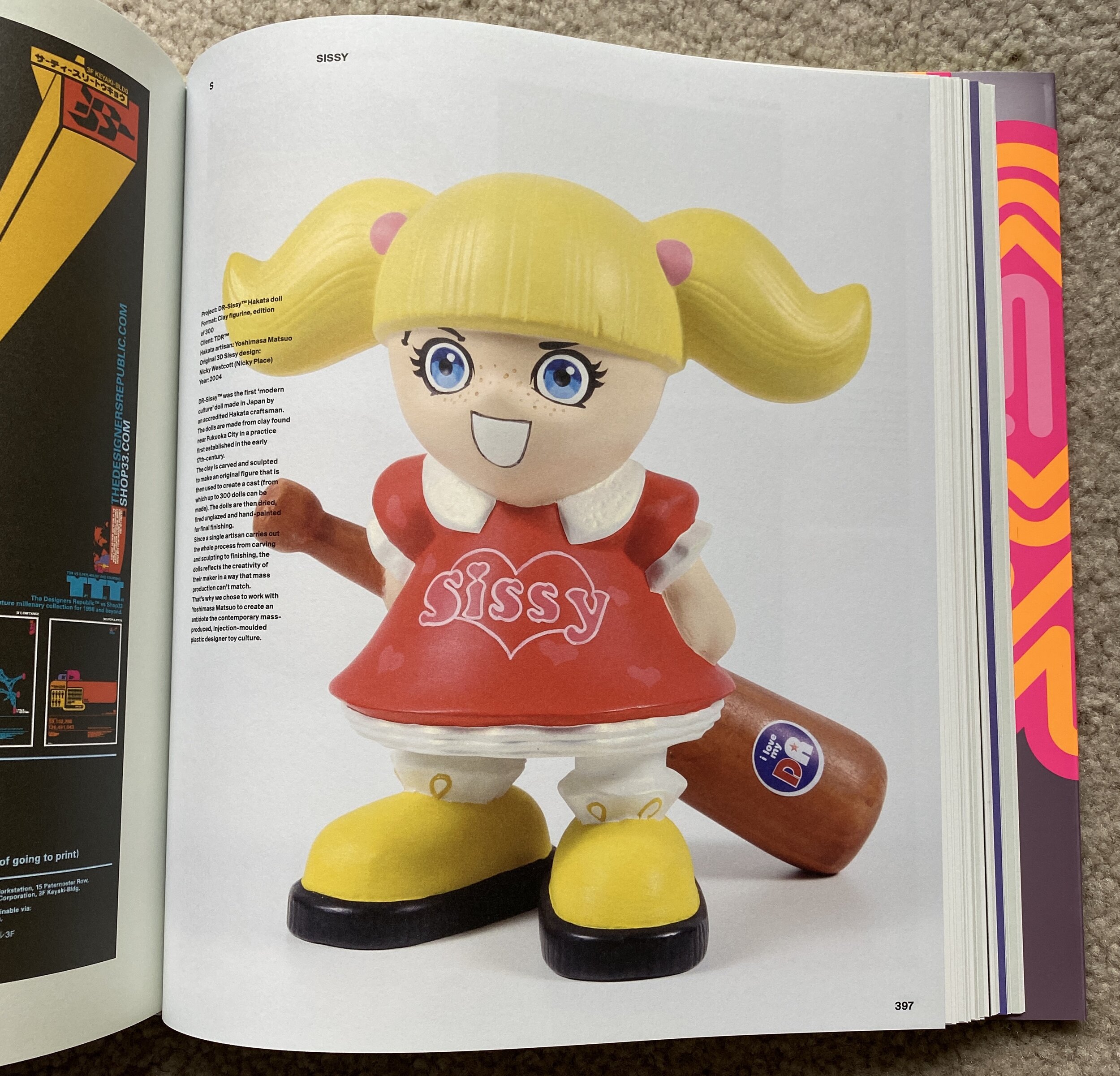
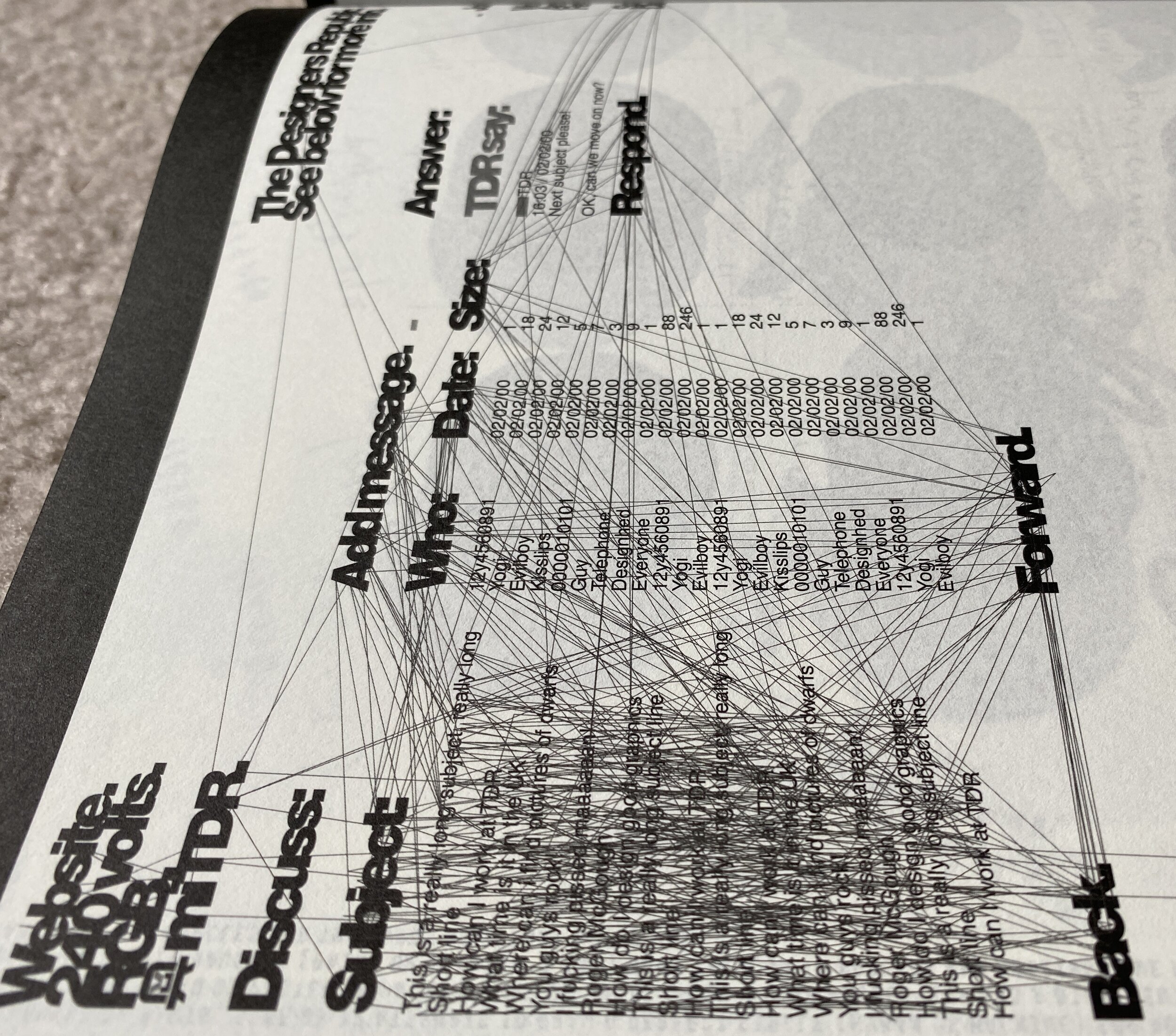
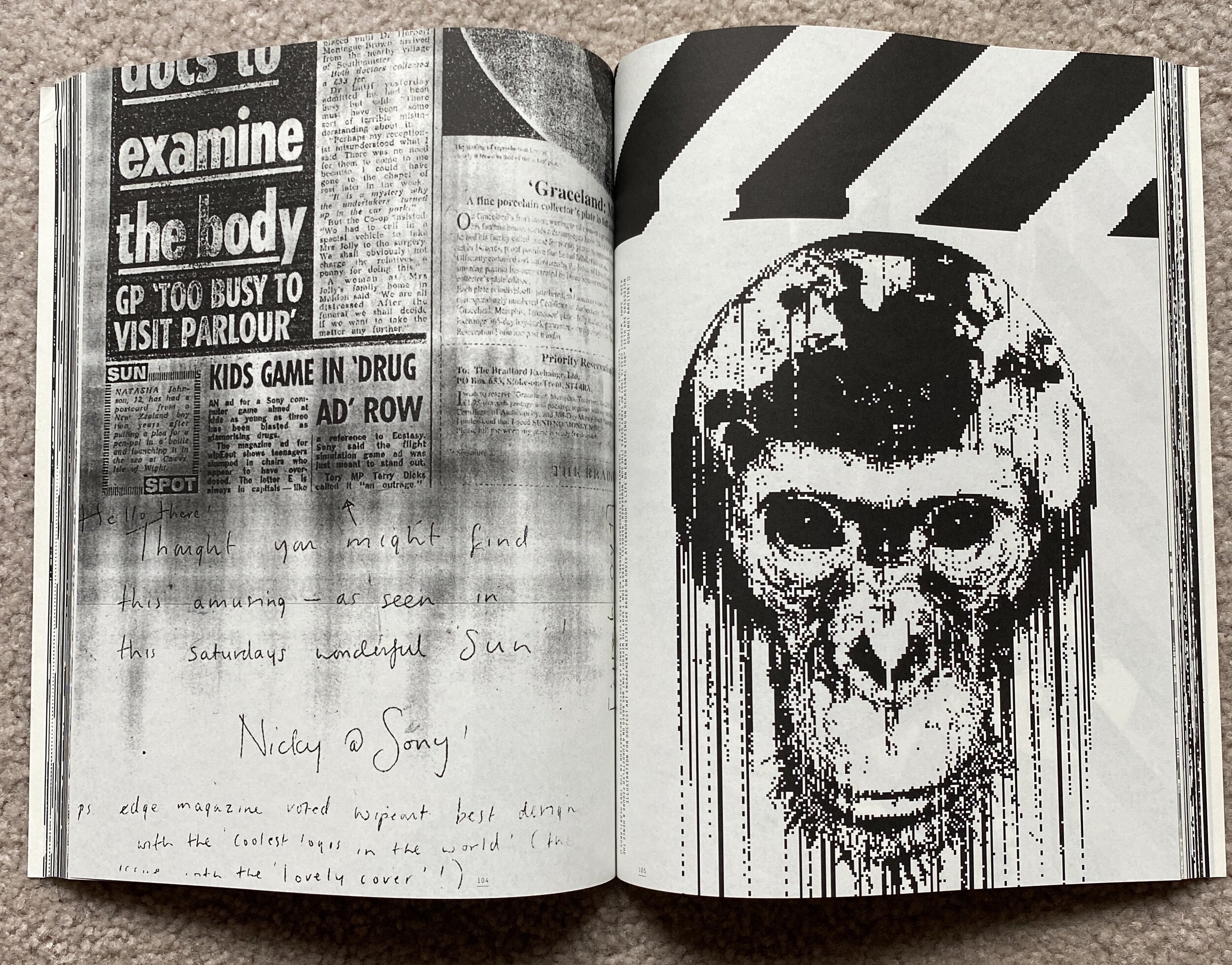
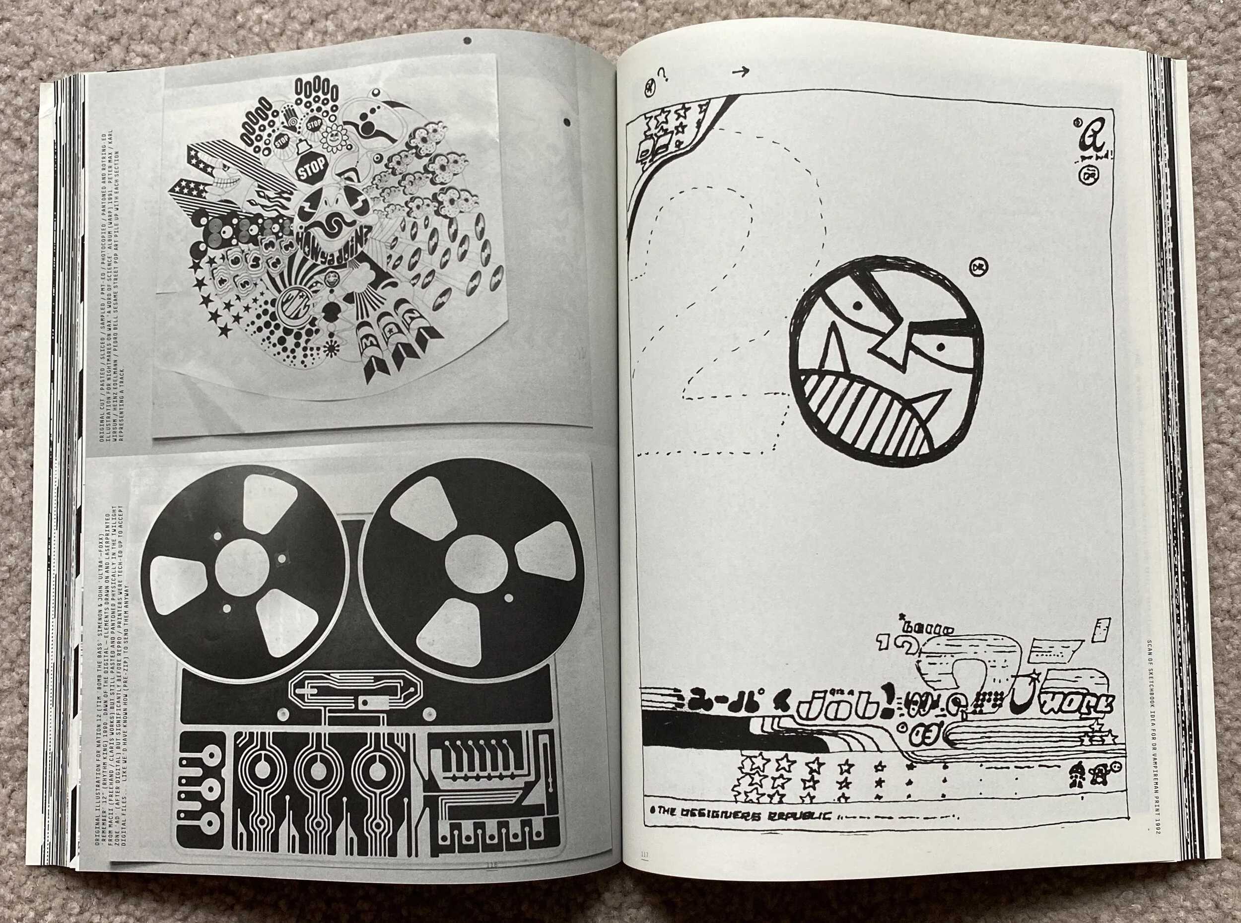
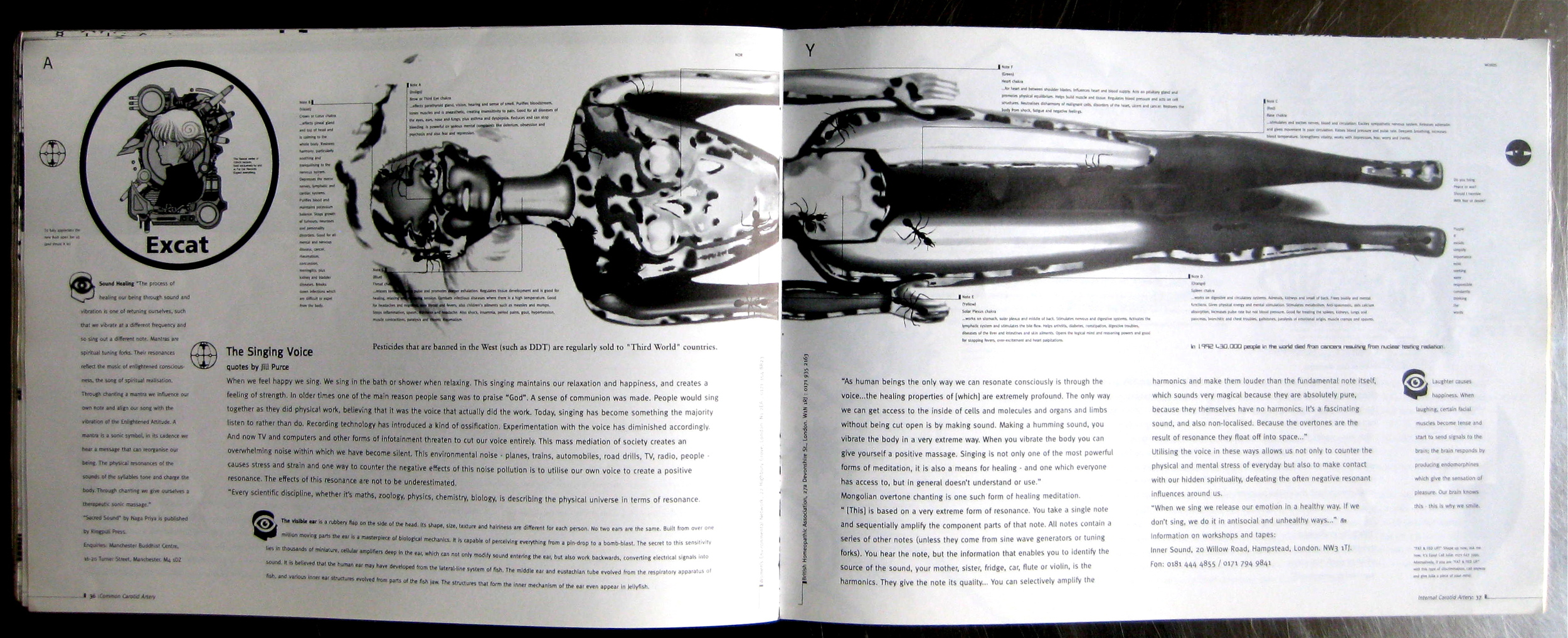
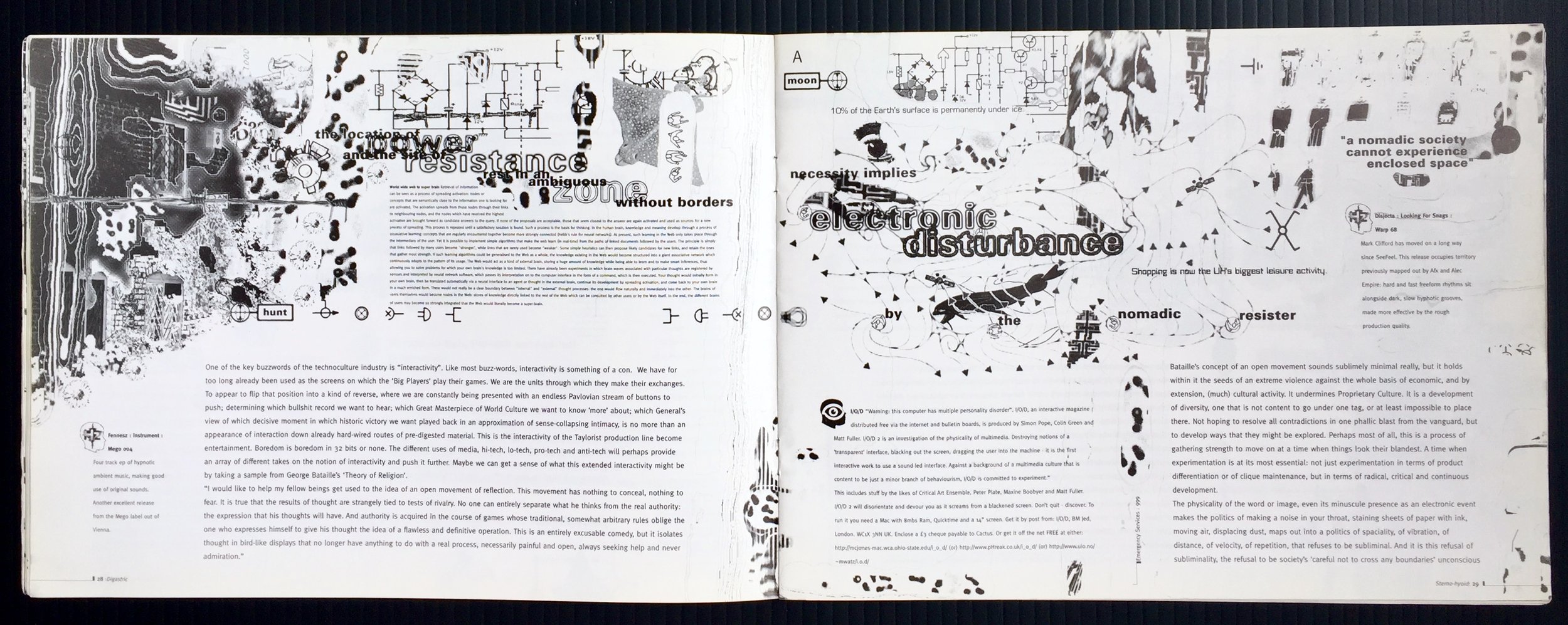
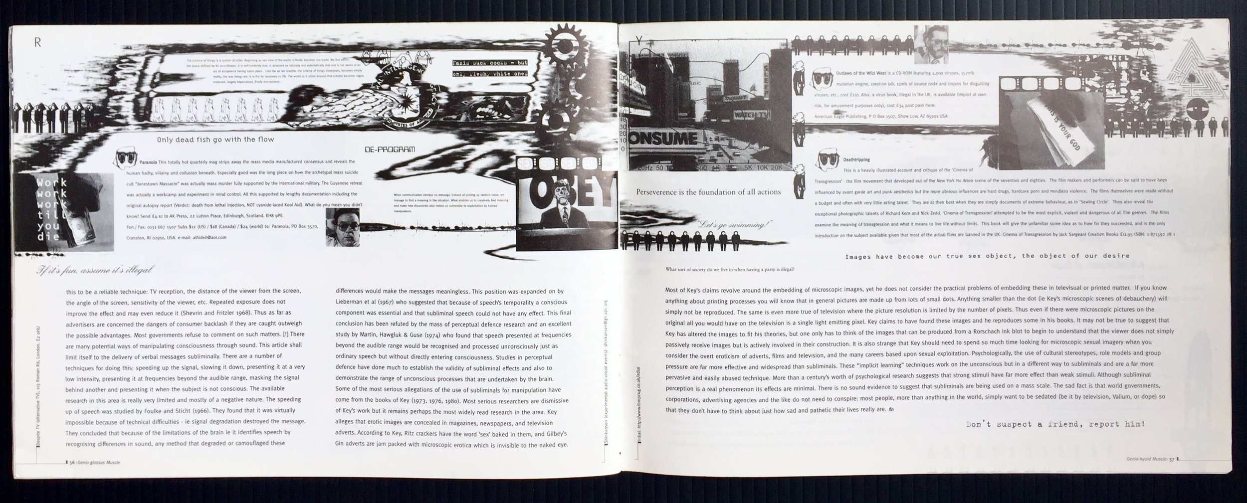
As I said it’s got a lot in it. I love these monographs as they always show lots of prep work and ideas, not just the finished pieces - so much more to be discovered there. Here’s just a few spreads and pages from this 512 page, very hefty tome.
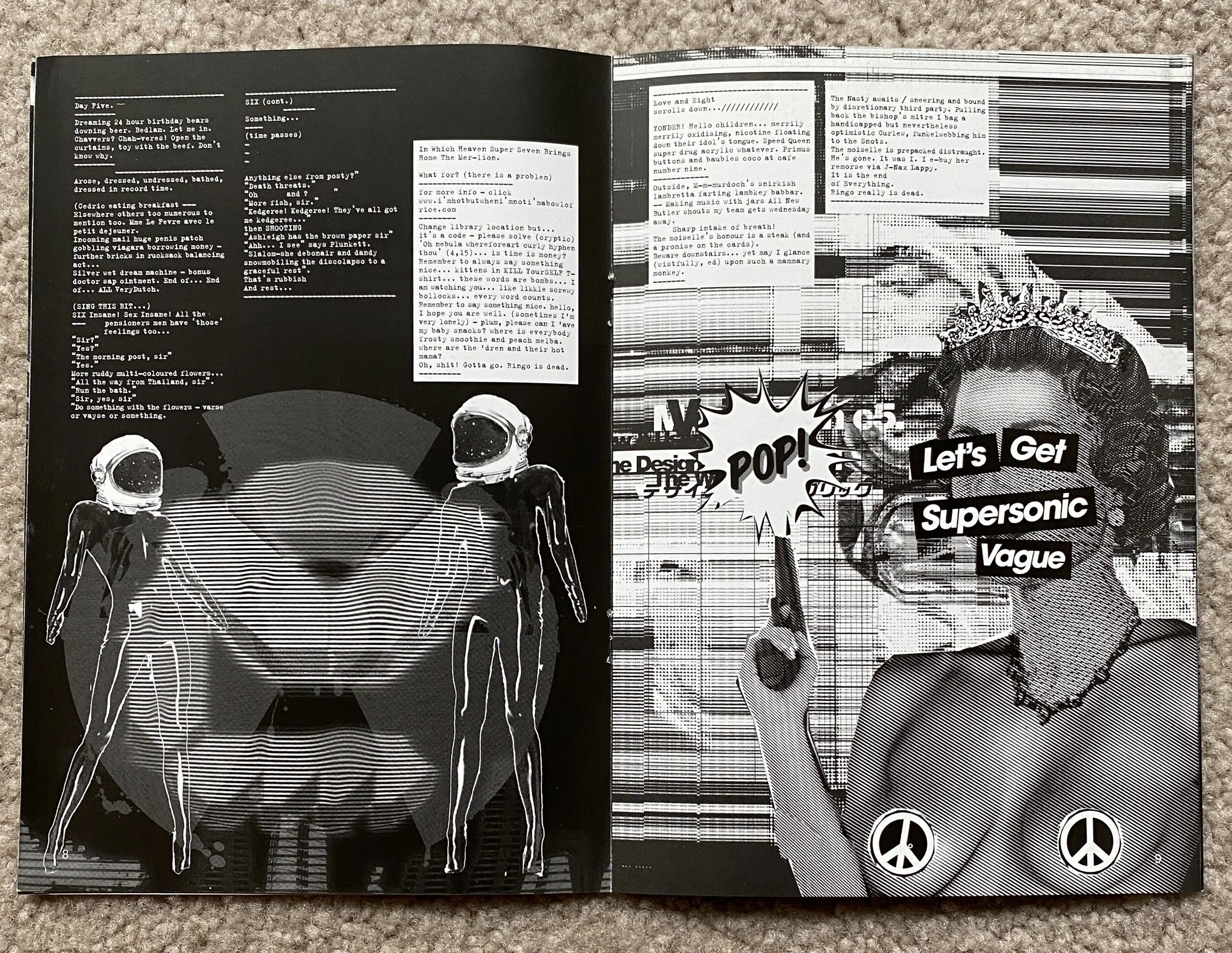
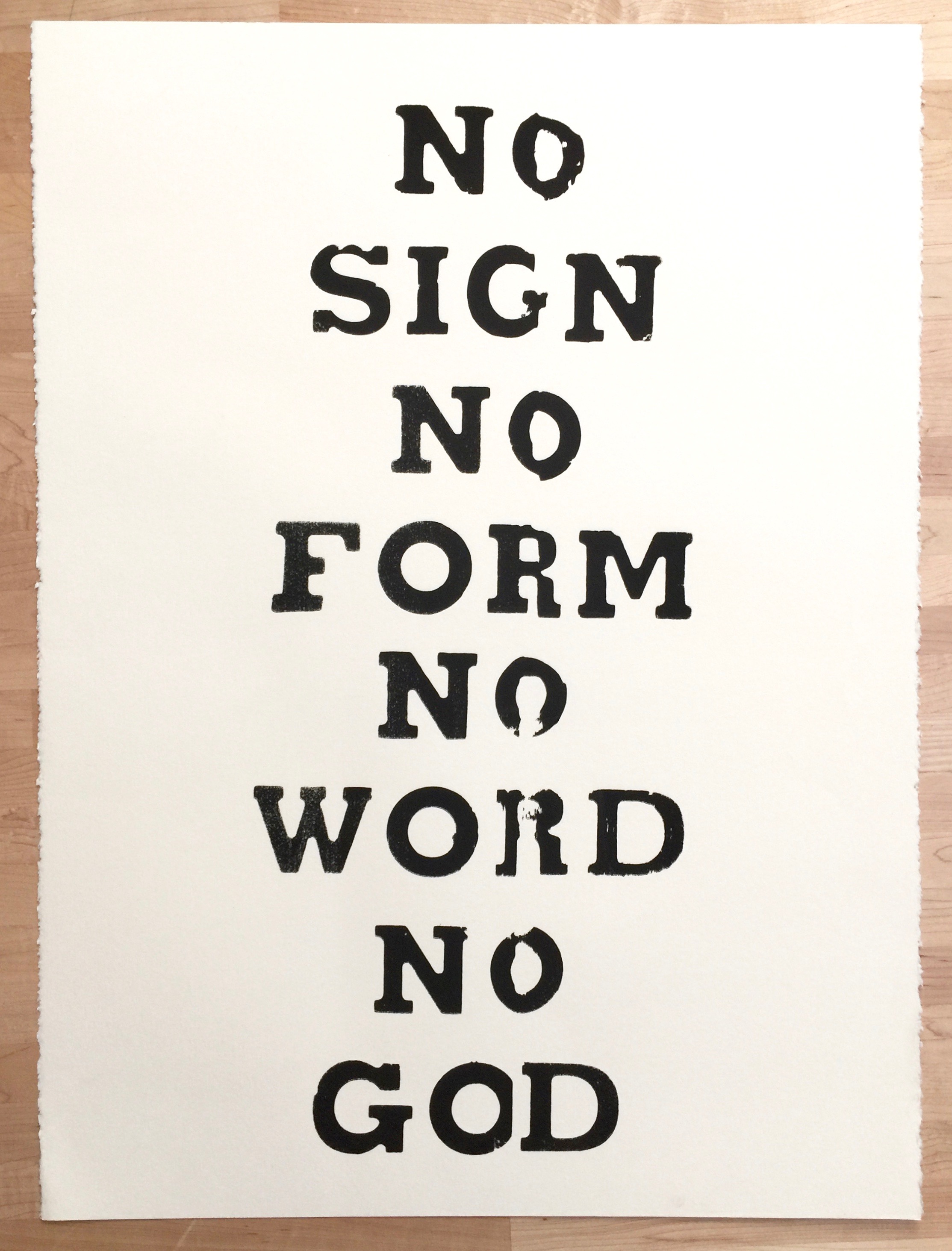
With the main book came another book or catalogue of their studio work. It’s black and white, noisy and almost zine like. The back cover is perfect and seems to nail who they are in this simple and wonderful typographic gag.
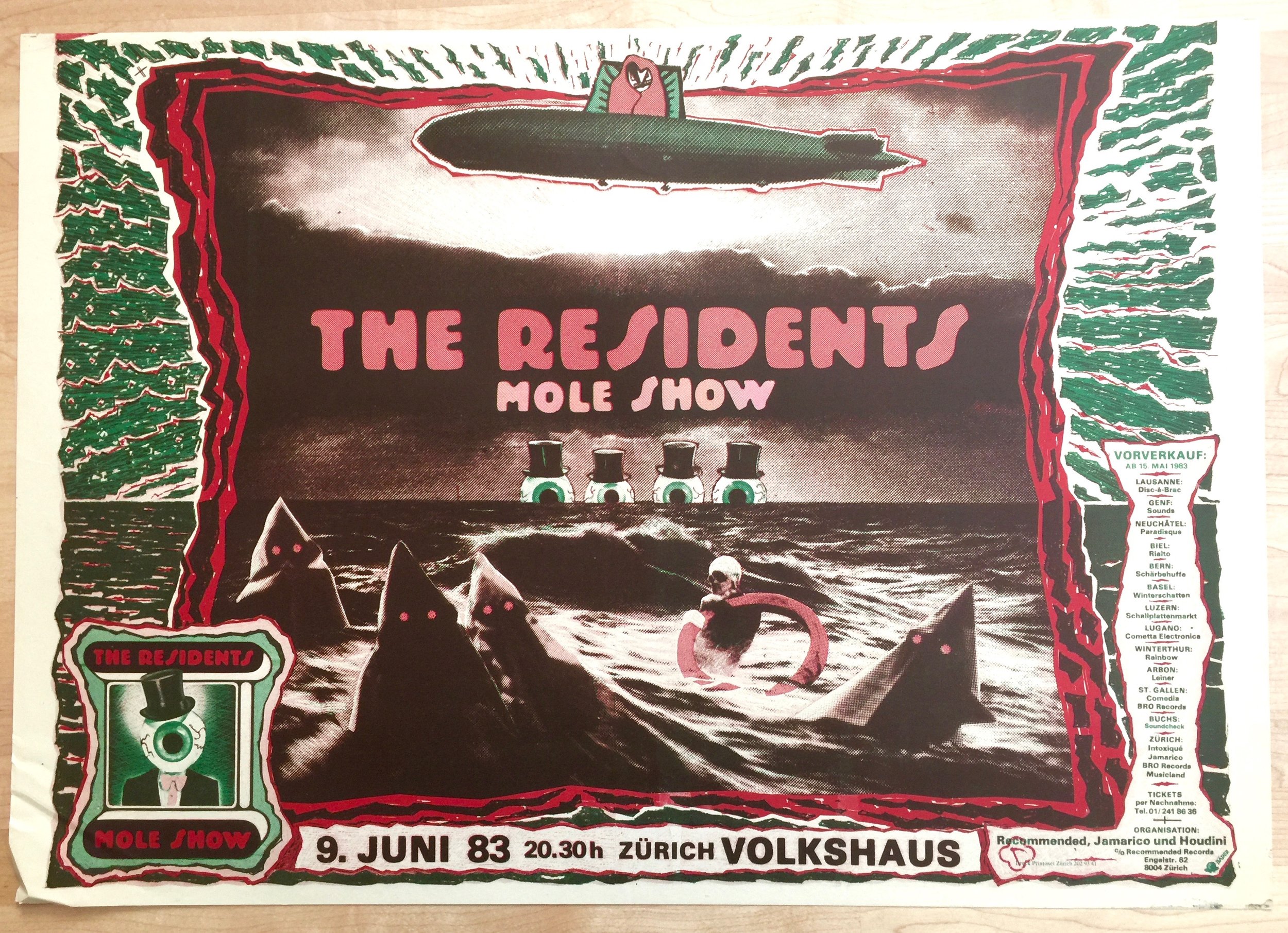
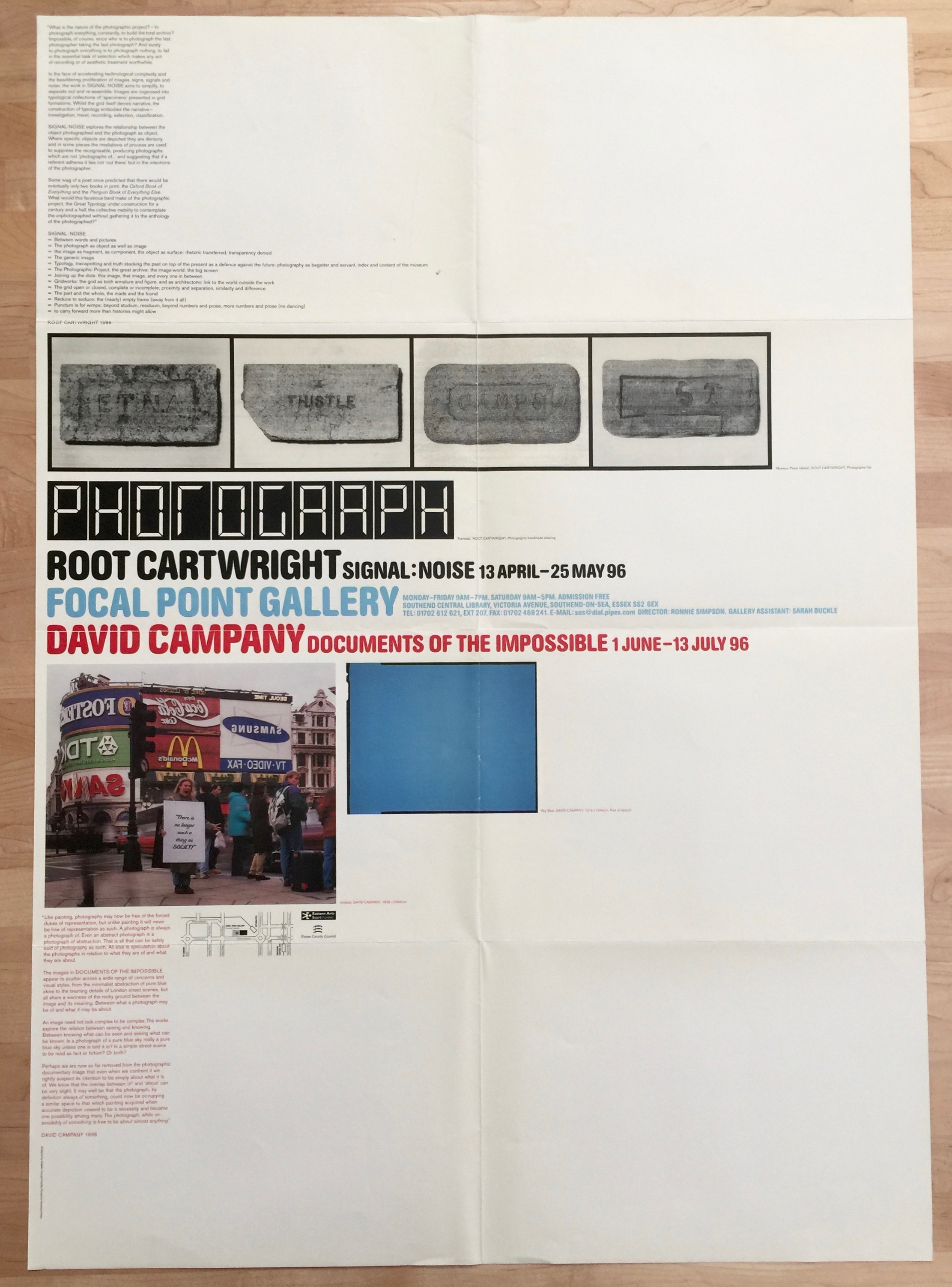
Of course that was not all that was in the package. There was a bunch of ephemera, a tote bag and stickers!!
It’s one of the best packages I’ve received in a long time and thoroughly cheered me up.
However, it’s sad that with all the current political horse shit going on, this particularly salient piece of advice once again fell on deaf ears. Oh well time to start fighting hard again.
Here’s the book https://www.uniteditions.com/products/a-z-of-the-designers-republic
