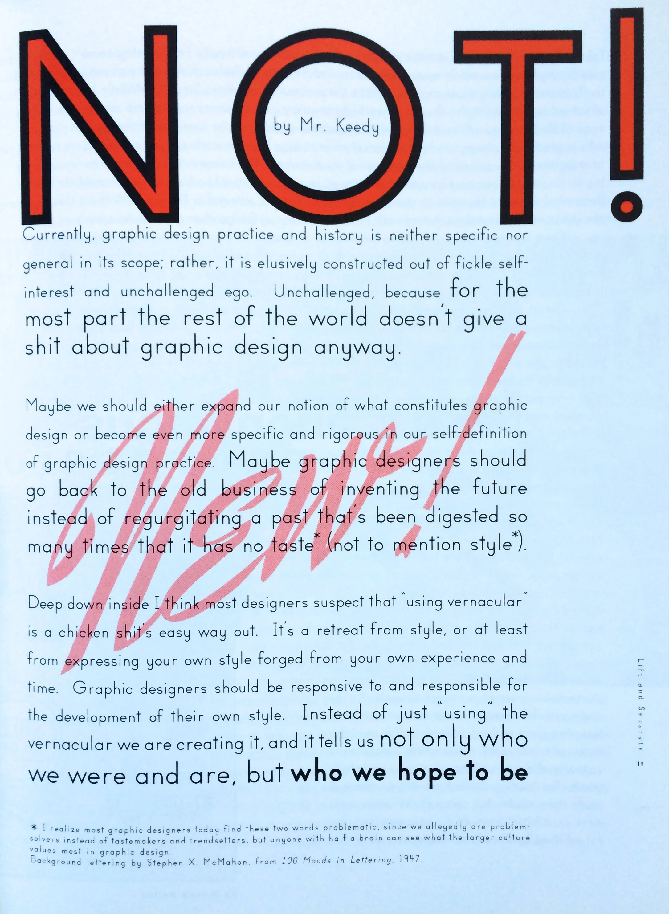
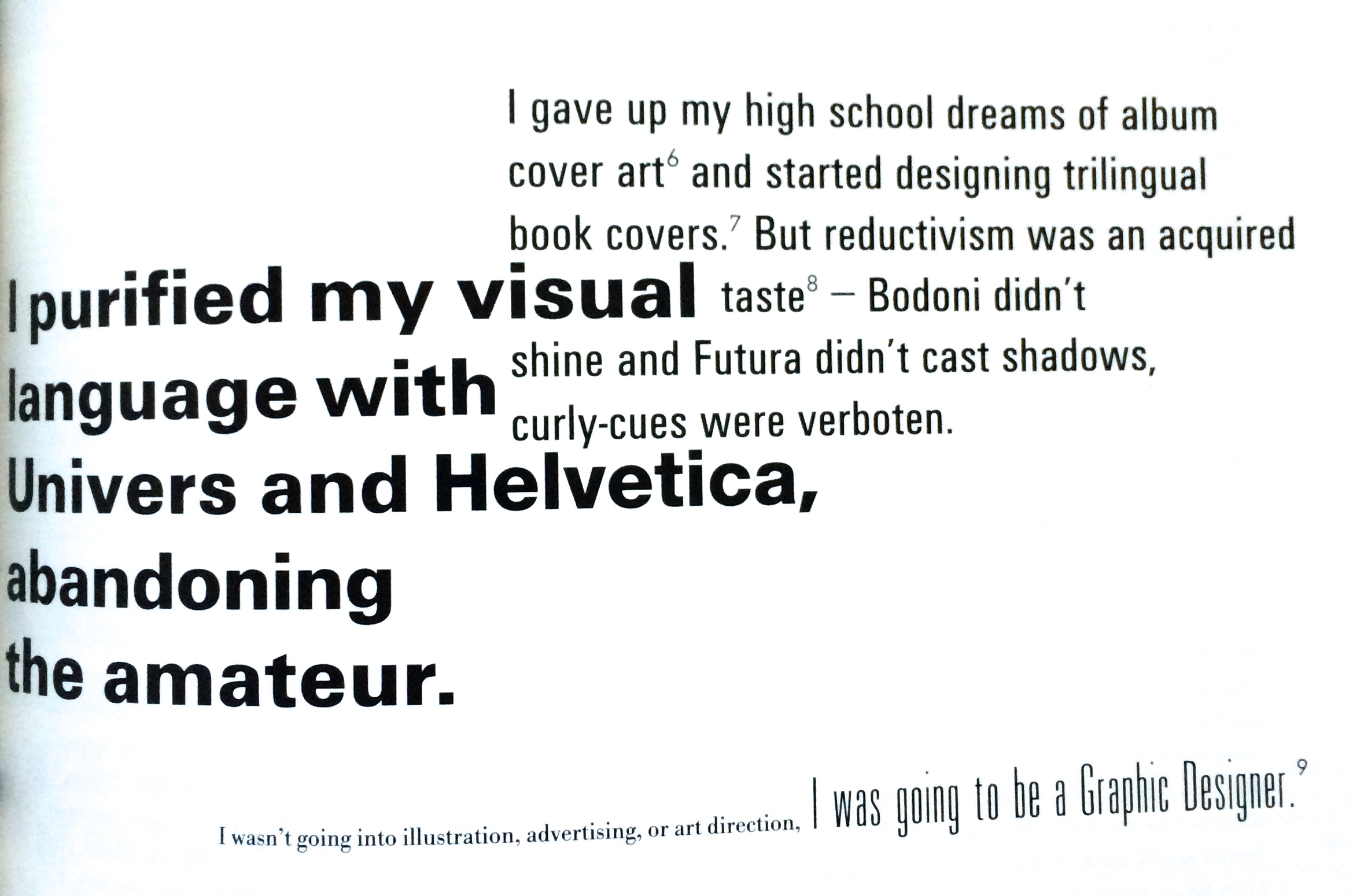
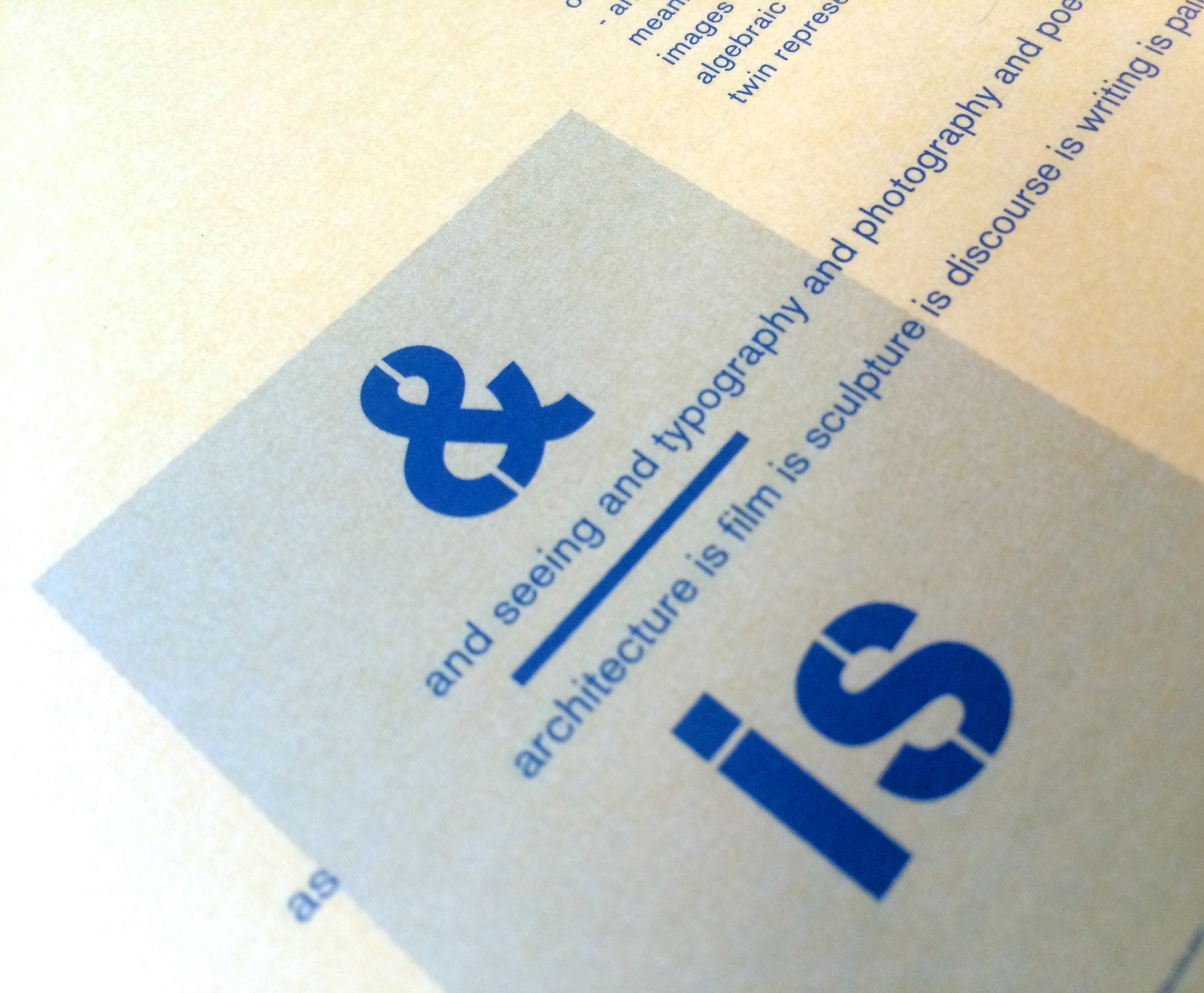
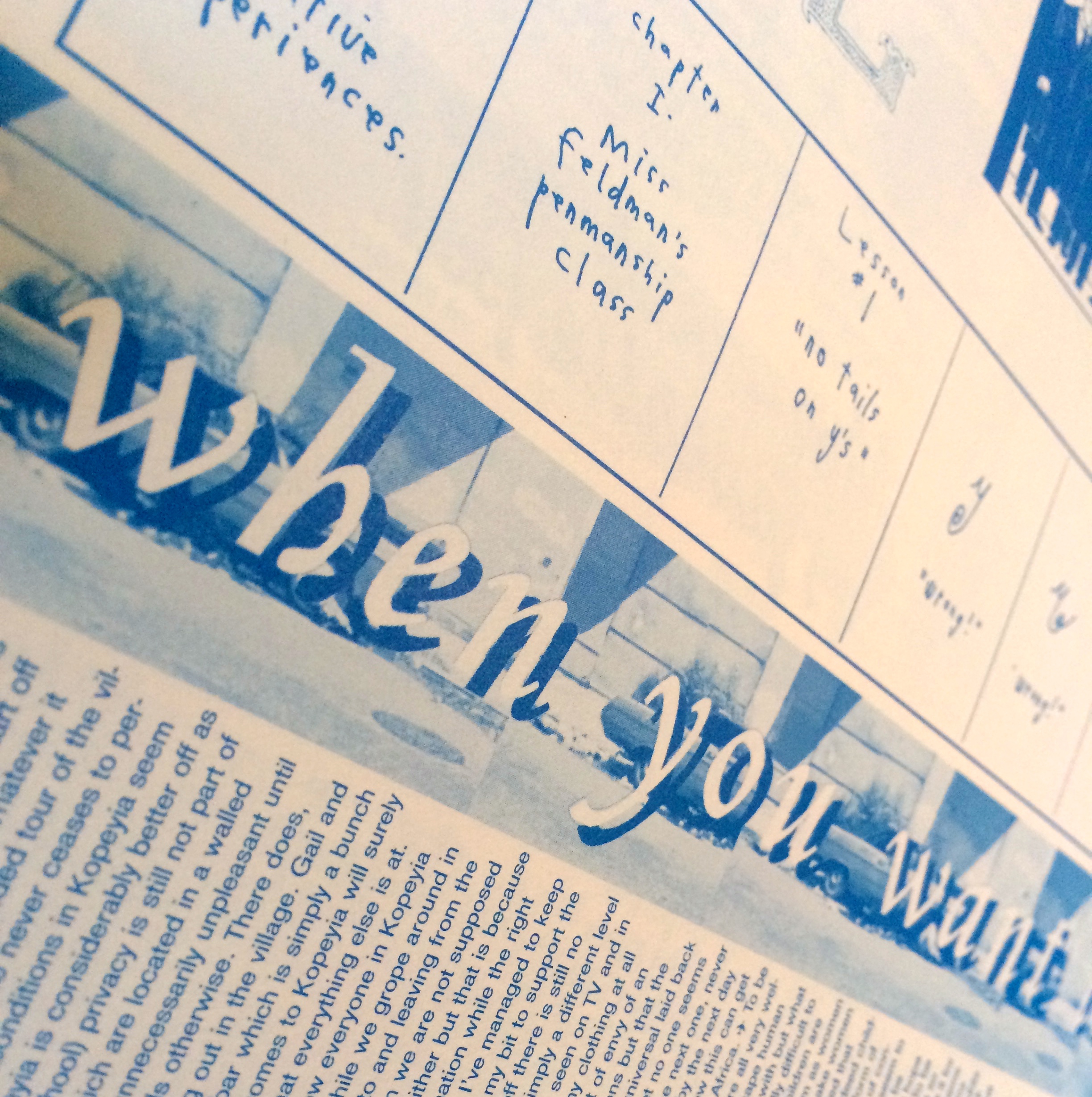
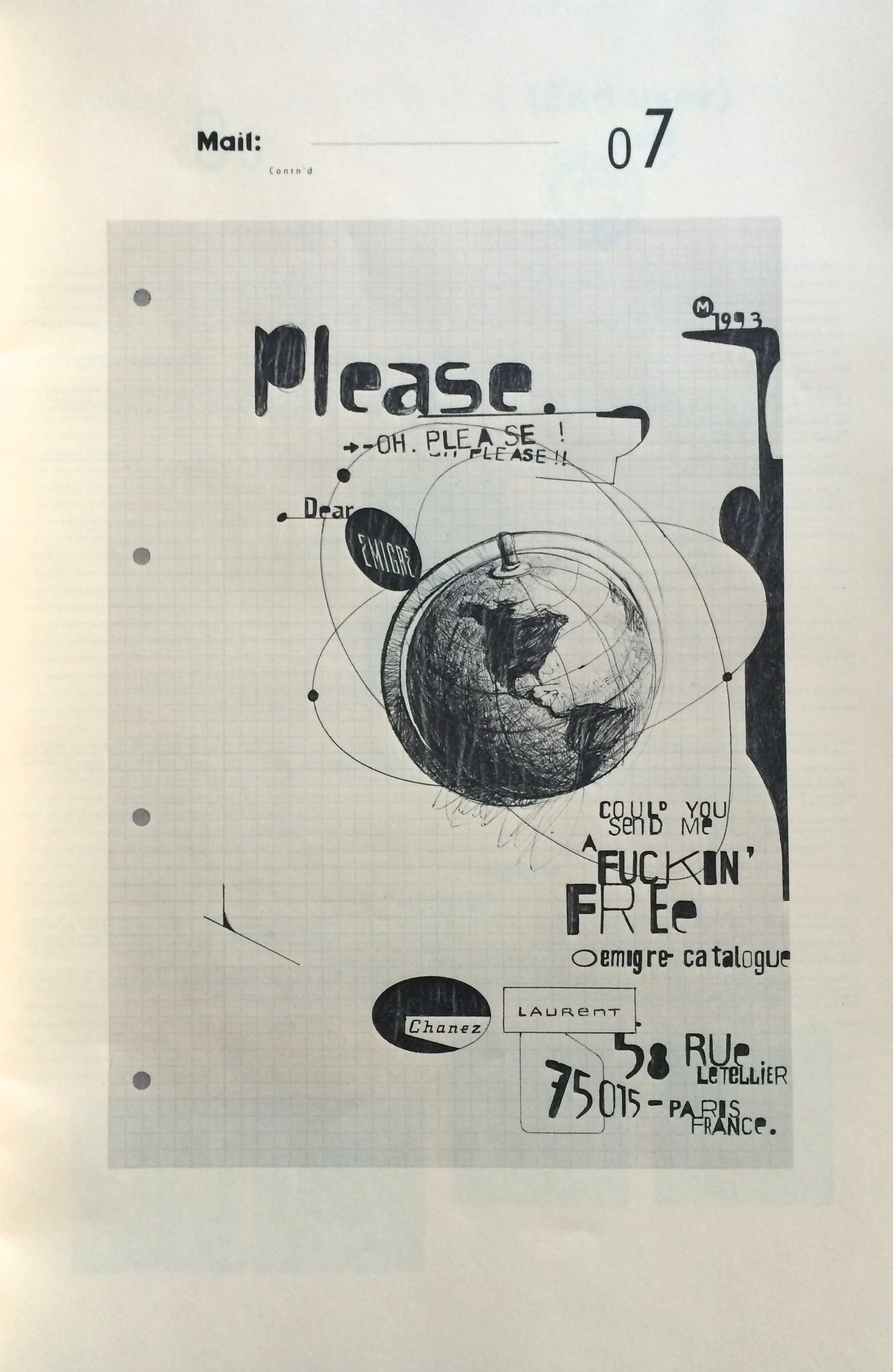
Lift and Separate is a lovely tactile journal, very much in the spirit of Emigré and Eye. It was published circa 1993 by the Herb Lubalin Study Center. What I really like, is the piece on vernacular and the journey from drawing fanciful letters in a note book to purging the ornaments and being a 'proper' designer. That shift to proper type and the favouring of Univers and Helvetica over all else. I think a lot of designers went/go through this, only to discover that the objective purity they believed those fonts provide isn't real, it's just another stylistic choice. As I've gotten older I've grown to love hand drawn, found and everyday type. The myriad of visual languages that exist outside the strict world of acceptable 'current' graphic design. There's something wonderful about the bad, broken and 'ugly' - but I do still love Univers.
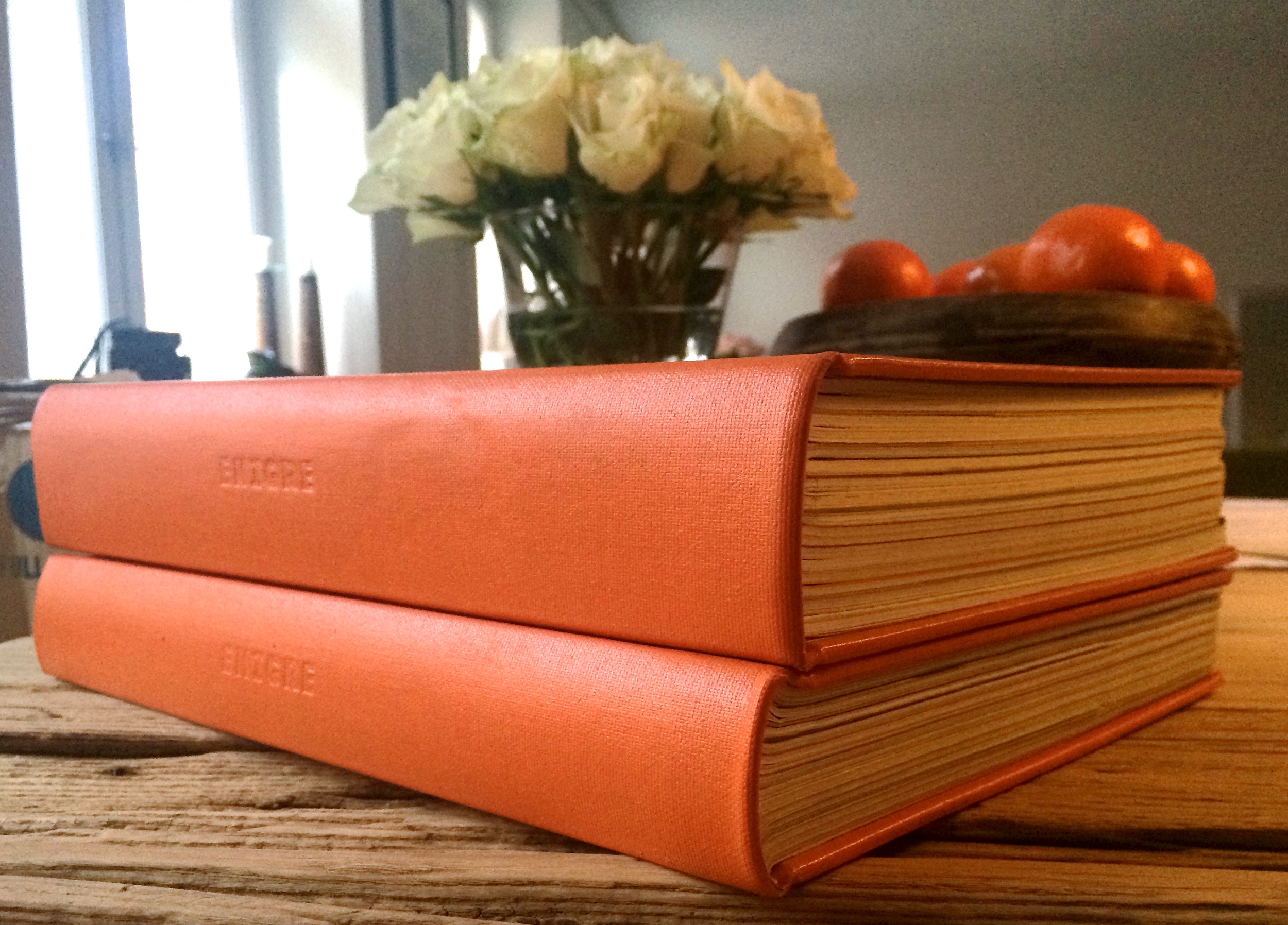
Emigré the journal issues (33-49 bound)
I have a few loose issues of Emigré so when the bound volumes were released I had to grab them.
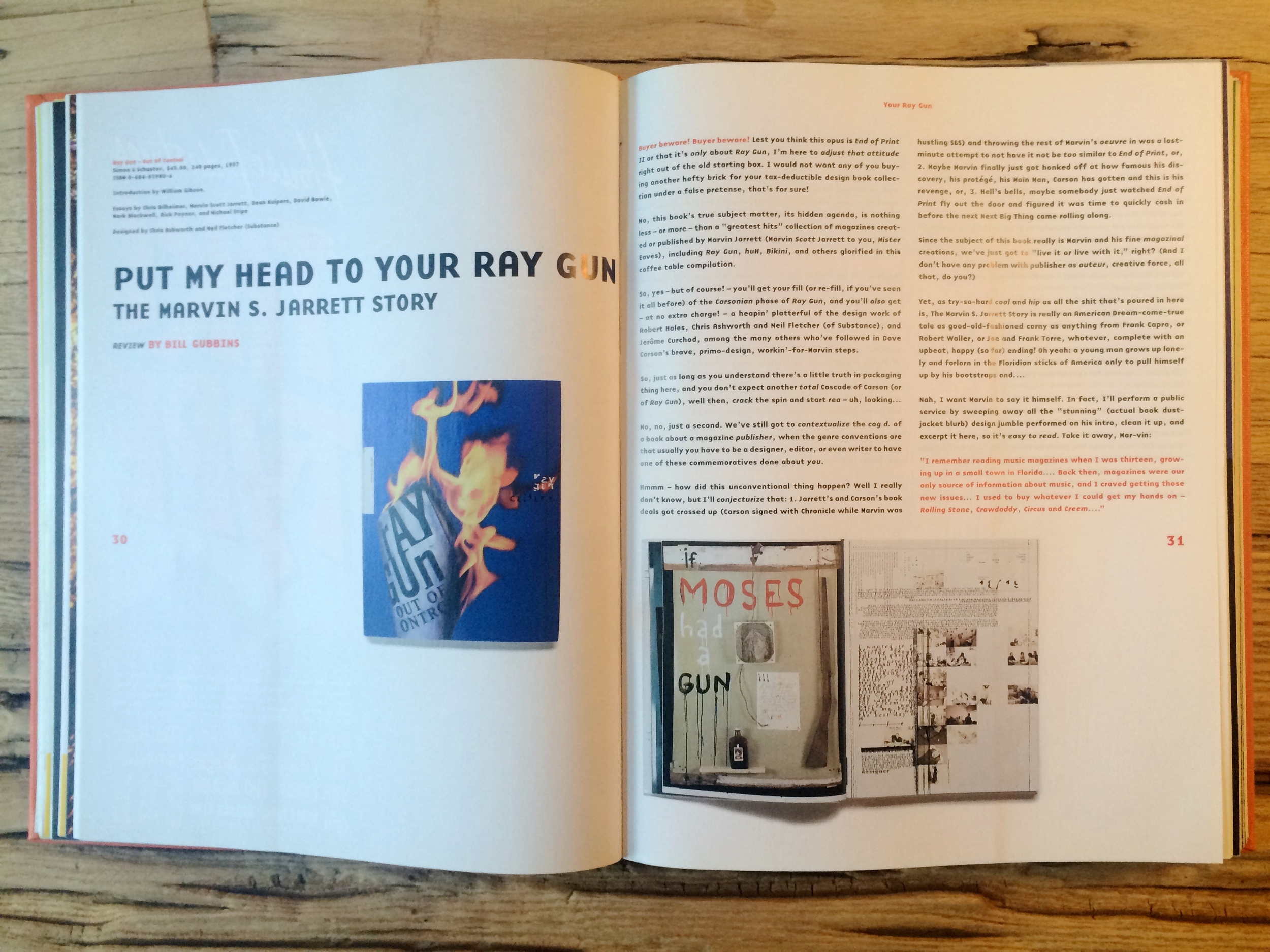
These are from the more theoretically engaged period, epitomised by the mouthpiece series. Great to look back on and see the issues that raged and in many cases are still raging, it's like a graphic design time capsule - awesome.
And here's a bunch of close ups.
http://www.emigre.com/
Issue 26 of Emigré magazine
This is one of the later issues (No. 26 Spring 1993) of Emigré that was published in the large format. Fairly soon after this it went to a smaller journal like publication. Interestingly this coincided with a shift in graphic design writing. A move away from pure design expressions and visual exuberance to critical theory and the rapid intellectualising of graphic design. The digital revolution was in full swing and digital type and challenging the traditional rules was the norm. Endless debates raged about legibility and the 'cult of the ugly' and we had a new set of design superstars such as David Carson (End of Print was published 1995). It was an interesting time to be a design student.
The large format versions reflect the visual heyday of Emigré and most of the items in this earlier post are from that period. They focus on the design practice and artefacts rather than the discourse - they don't ignore the debates, rather they are about showing them, not waxing lyrically upon them. The smaller format editions cover the design debates in a more writerly fashion, a more traditional journal. It was a period when graphic designers were very actively and intellectually engaged with their work and it's impact. I have the bound volumes from the small journal (issues 33-49) and will post about them some time in the near future.
Enquire within - a designer's art
This wonderful little design artefact was created by the late, great Ian Noble. It's self published and I believe was created for his Masters work at Brighton. Part puzzle and part intellectual exercise - it's a lovely design object. One of the things I love about it is its visual patina. It's only a two colour print job but through the use of found ephemera, rubber stamps and stickers it manufactures a rich and intriguing look and feel. Its very design stimulates the reader to enquire, to investigate what it is all about. Very much a labour of love, with each copy having a uniqueness through the many hand crafted elements. This is one of 150 copies.
I was an undergrad when I first met Ian and was lucky enough to have him as a tutor. He opened my mind to many ideas, from 'pataphysics to the necessity for designers to take responsibility for their work, not just the design but it's also it's effect on the world. He taught the importance of ethics in design and how the things we create always have an agenda and an influence - there are always politicised, whether we accept it or not. Sadly, Ian passed away two years ago this January, but I'm sure for everyone that he touched his influence is still very much at play and the design world is a better place because of it.
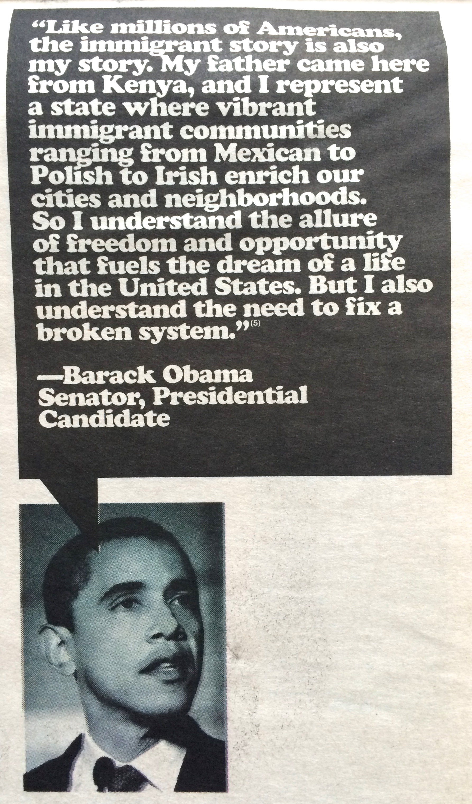
American Apparel's Legalize LA
With hindsight, perhaps this campaign may have been a little misguided, after all this is a cheap clothing manufacturer. However it's still a great stance and an important issue.
I particularly like this early Obama quote.


