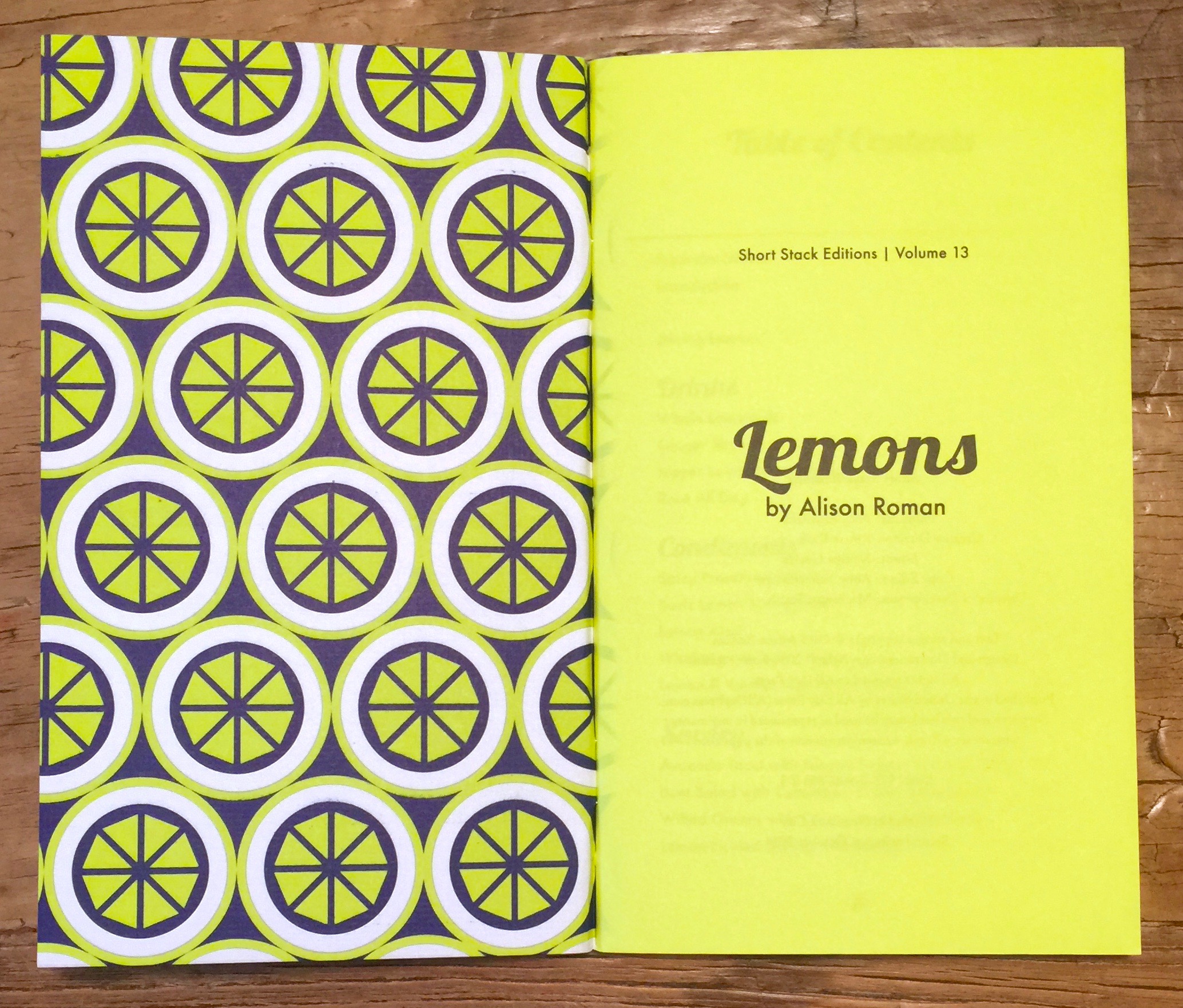
Today I discovered Short Stack Editions whilst taking a perusal around Heath Ceramics. These are lovely small, 'pamphlet' sized recipe collections. I picked up two volumes: volume 8, Honey by Rebekah Peppler and volume 13, Lemons by Alison Roman. Each focuses on a single ingredient by a single author. They are beautifully put together, with each edition themed to the subject, including carefully chosen coloured stock to match the cover colour way. Even the twine used for the binding has been matched to the colour way - beautiful attention to detail and the person who sews each one gets a credit. The use of patterns on the covers makes them the perfect choice to be stocked by Heath - great compliment to their awesome tiles.
Strategy cards for the day job
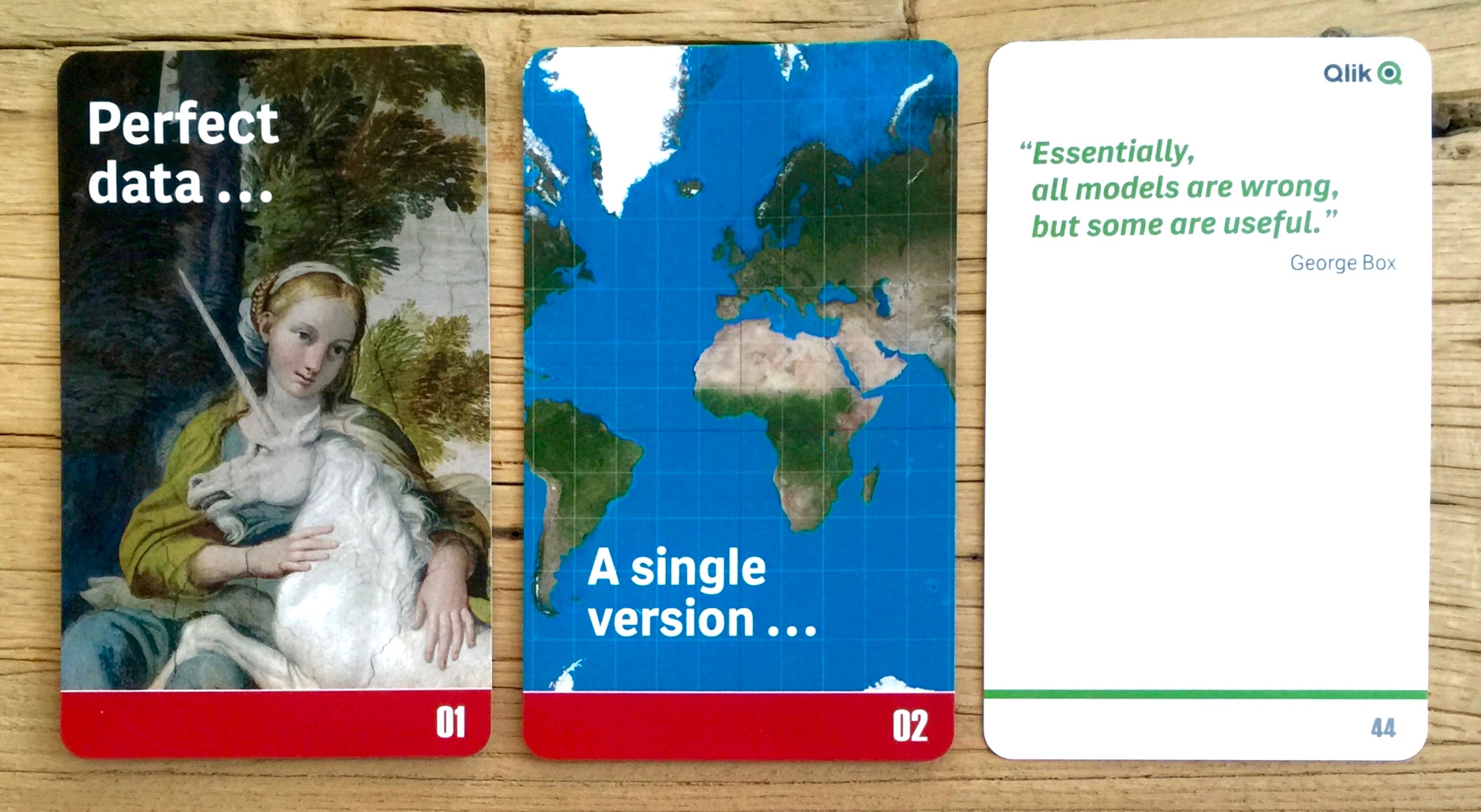
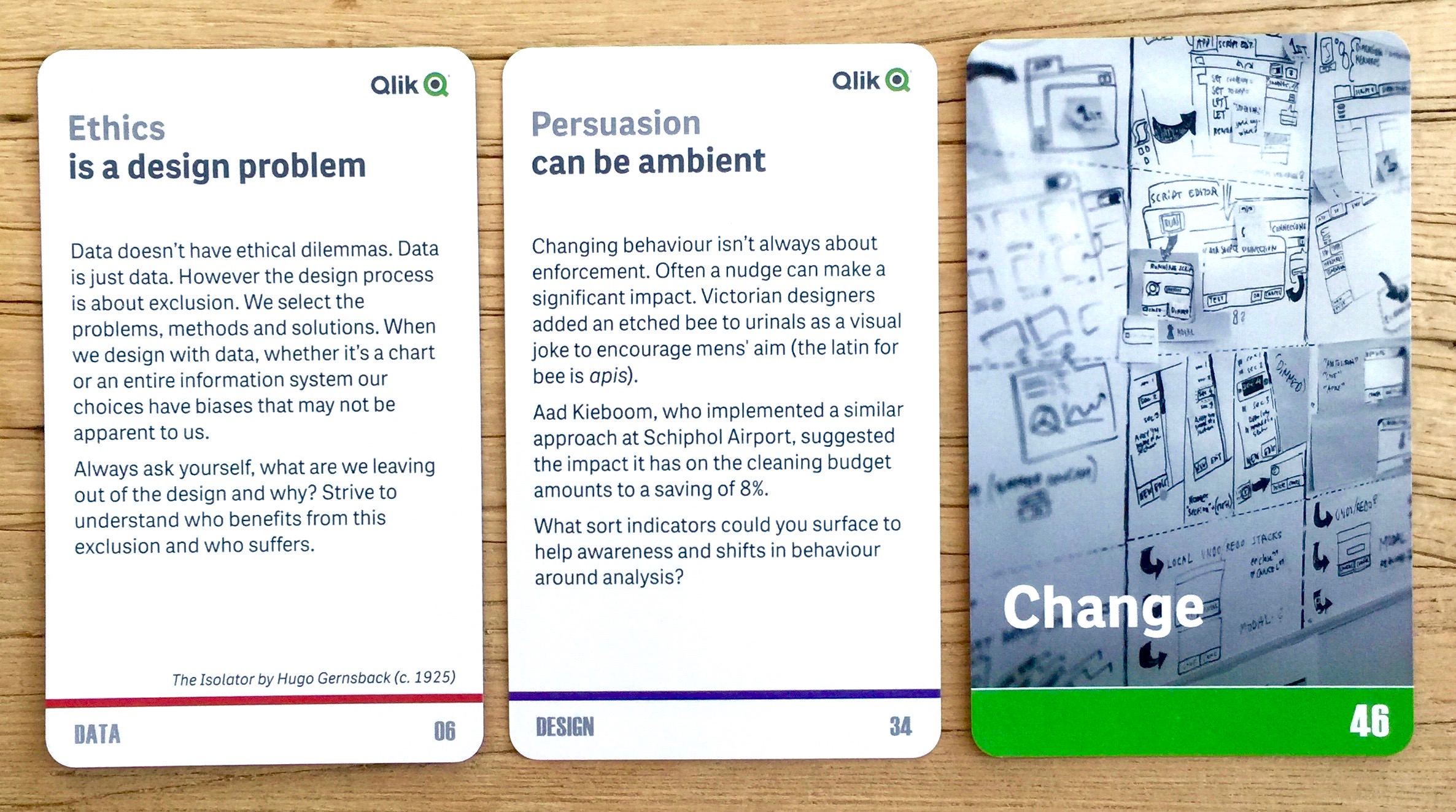
Mostly I keep this blog personal work free. However recently I put together a pack of strategy cards on working with analytics and data for my day job at Qlik, more details here. It was a fairly rapid project, 6 weeks from concept to delivery.
It's been a long time since I made something tangible (mostly digital only these days) and it was a real treat. My colleague James Richardson was the writing lead on them and I co-wrote and art directed (and artworked). The images are almost all from public domain sources such as New York Public Library's public domain archive and PublicDomainReview.org, apart from a couple of stock and a few self taken. We had a tight deadline as we wanted to distribute them at an event so we took two approaches to production. The plan was to get the cards offset printed in Singapore by Ho Printing on 420gsm artboard, then shipped and hand collated and boxed by me. Thankfully that worked out great. However, our back up plan was to use the on demand digital card printing service from printerstudio.com. We got a couple of packs as proofs and I want to stress how happy I was with the service and quality of the cards from Printer's Studio. They are really great, the stock is much lighter 310gsm but they still feel high quality as they have a slight linen texture and the colours are great (see, purchase here).
Anyway here's the cards - these are the offset versions (the colour in these pics is a little off as iPhone and indoors).
UPDATE - explore all the cards here https://murraygm.github.io/qlik-bi-strategy-cards/
Zembla Magazine issue 1 - words, pictures and graphic design gorgeousness
Since the early 2000s there's been an explosion in high quality independent magazines. These are often lovingly crafted, hugely indulgent, hyper focussed niche offerings. Not aimed at mass distribution or high ROI and usually not the most successful business models. One of these magazines that appeared briefly (only 8 issues) on the mainstream newsagents' shelves was Zembla. It positioned itself as a literary magazine, with words fundamentally at it's core. Designed by Vince Frost, it's was a wonderful playground for typographic ideas, letter play and bold graphic design. It's not the grunge and dirt from the '90s but rather a rediscovery of type and the printed form.
Here's issue 1 from September 2003, with the rather special Tilda Swinton on the cover.
Seriously geekish purchase: Reissue of the Nasa Graphic Standards Manual
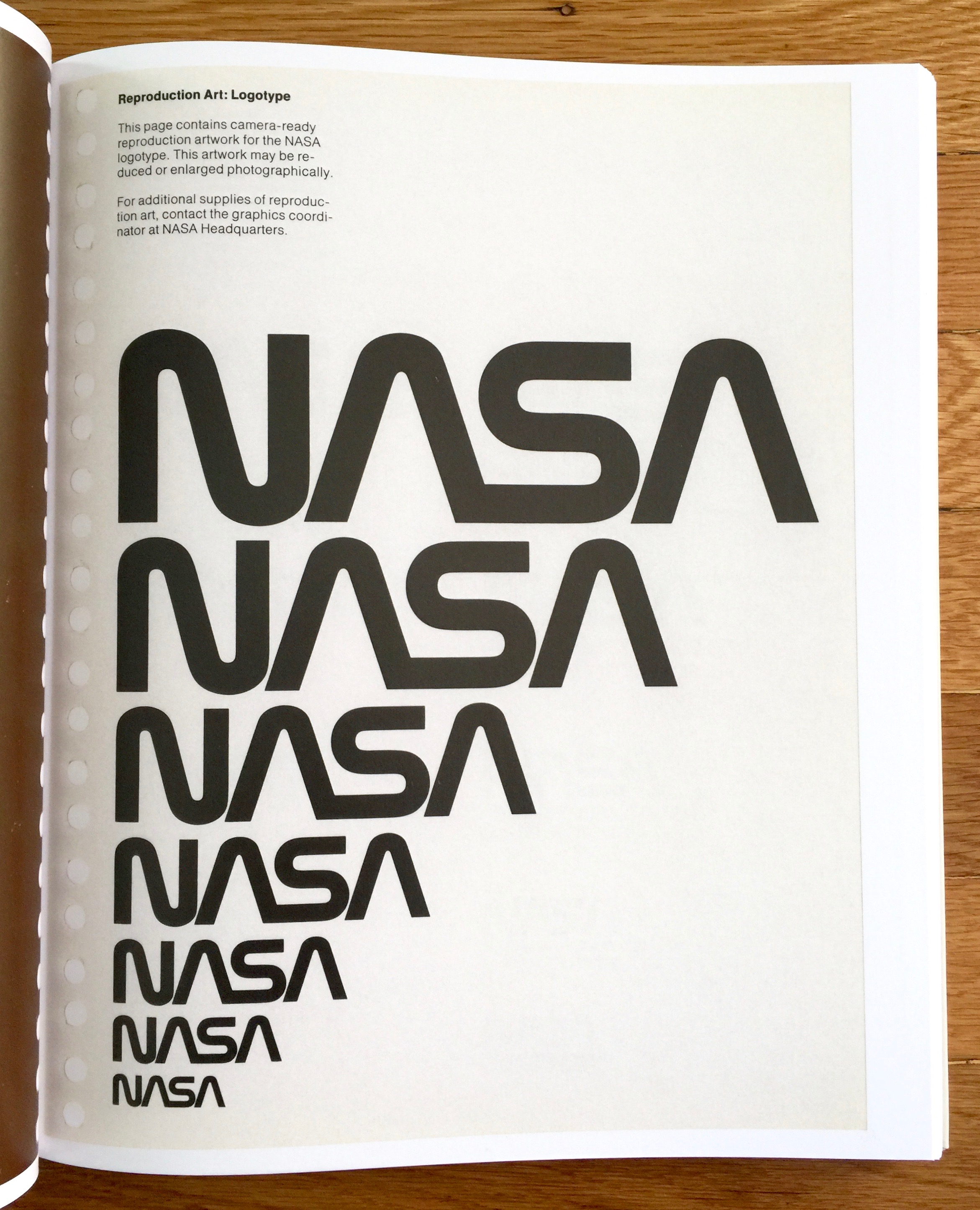
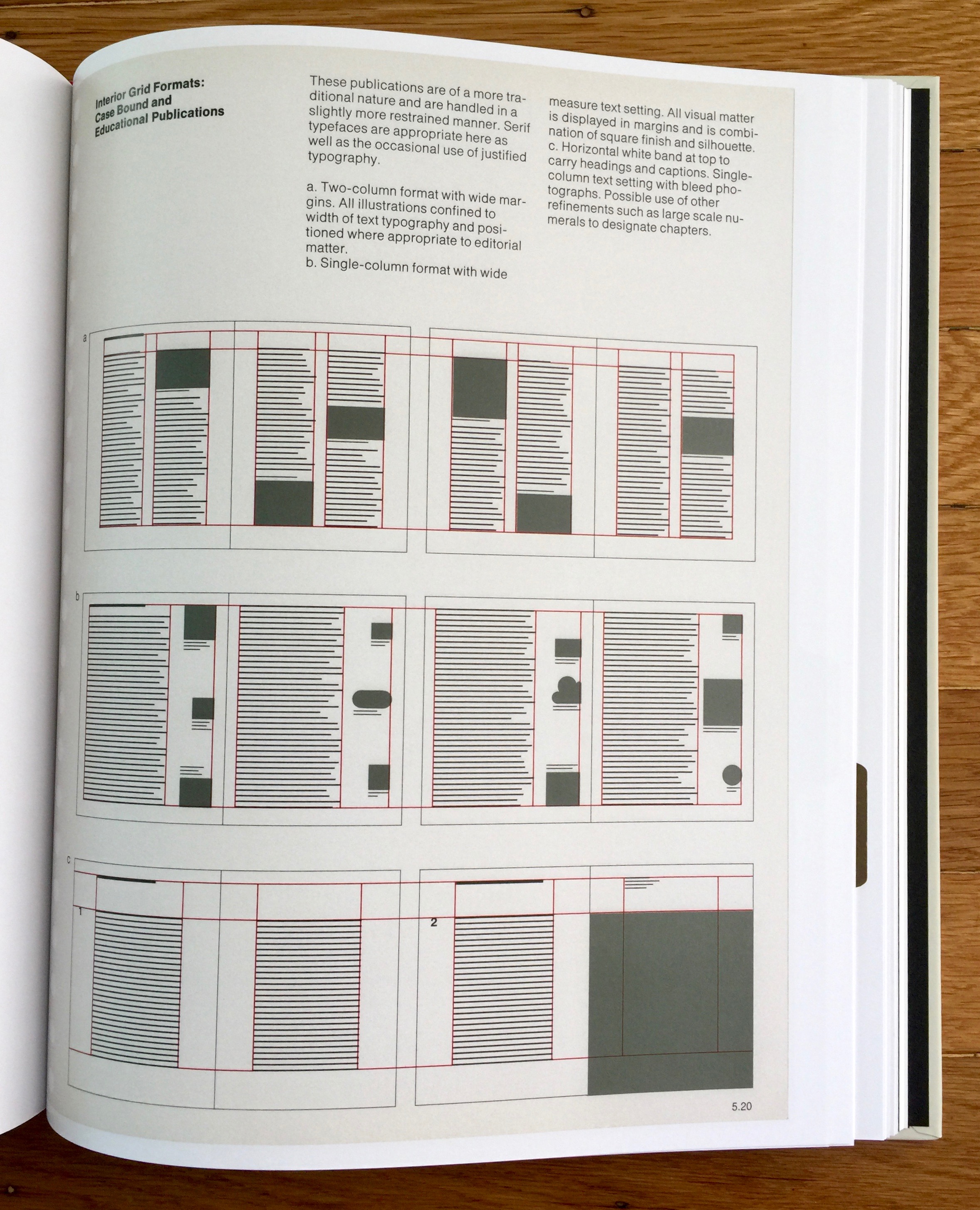
This is a graphic design and 80's child, double hitter. Nasa was so cool growing up (even in the UK). I think it was mostly due to the Space Shuttle with a little help from Moonraker. This reissue of the Nasa Graphic Standards Manual (Danne & Blackburn) from 1974, marks the identity change from 'meatball' to 'worm'. It's bound as a book and wrapped in a 'space aged' reflective foil envelope. The original was presented in a ring binder with hole punched pages, and it's those pages that have been scanned (including the holes) and used in the book. The reissue design team (Jesse Reed and Hamish Smyth) have reproduced all the fold out pages to create an accurate and loving (but bookshelvable) version.
For me the Nasa identity is something that screams space! Much more than Star Wars or Star Trek ever did because Nasa was (is) real, making the impossible possible and the bringing the unimaginable that bit closer. The style of the 'worm' mark firmly places it historically in the 70's/80's but somehow remains a timeless expression of space age design. I love the collapsed leading and condensed tracking on the full name National Aeronautics and Space Administration. As you'd expect the manual covers logo use, typography and colour as well as grids and layouts. But the really cool parts are the vehicle decal examples - it's not often that you get to show an example of your logo on a satellite and a Space Shuttle.
This is the first reissued standards manual I've picked up, but there's quite a trend for them at the moment. I think this is partly because they are beautiful objects that reflect the discipline and skills of pre digital graphic design, and partly because it's way more acceptable to be this geeky these days.
Grab a copy from the website https://standardsmanual.com/
For more standards and guidelines take a look at the marvellous United Editions imprint from Tony Brook and Adrian Shaughnessy https://uniteditions.com/
Vintage I-D Magazines (1981, 1983, 1984, 1985)
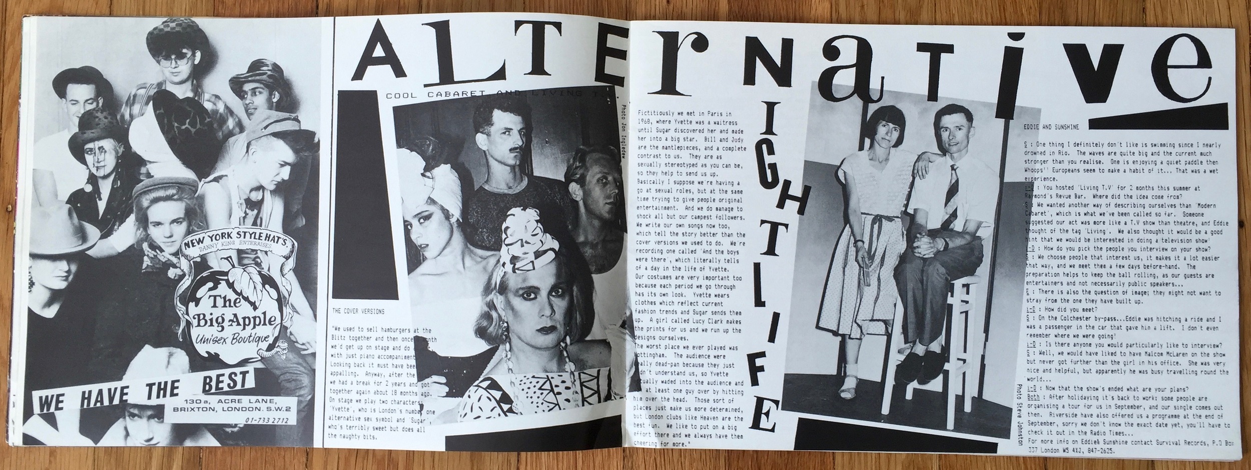
Rediscovered some old issues of I-D Magazine. They range from issue 5 (1981) to issue 28 (1985) and cover the mag's early progression from fanzine to fashion mag. First up is issue 5 aka the Lady Di issue. A spectacularly good typographic pun for the cover by 'Malcom "hot rod" Garr-art' (Malcolm Garrett), although I've also seen Linder Sterling credited.
I-D Magazine Issue No.5 Do-it-yourself Manual of Style (aka the Lady Di issue)
Here's the back cover with the 'cut out and keep' Lady Di parts.
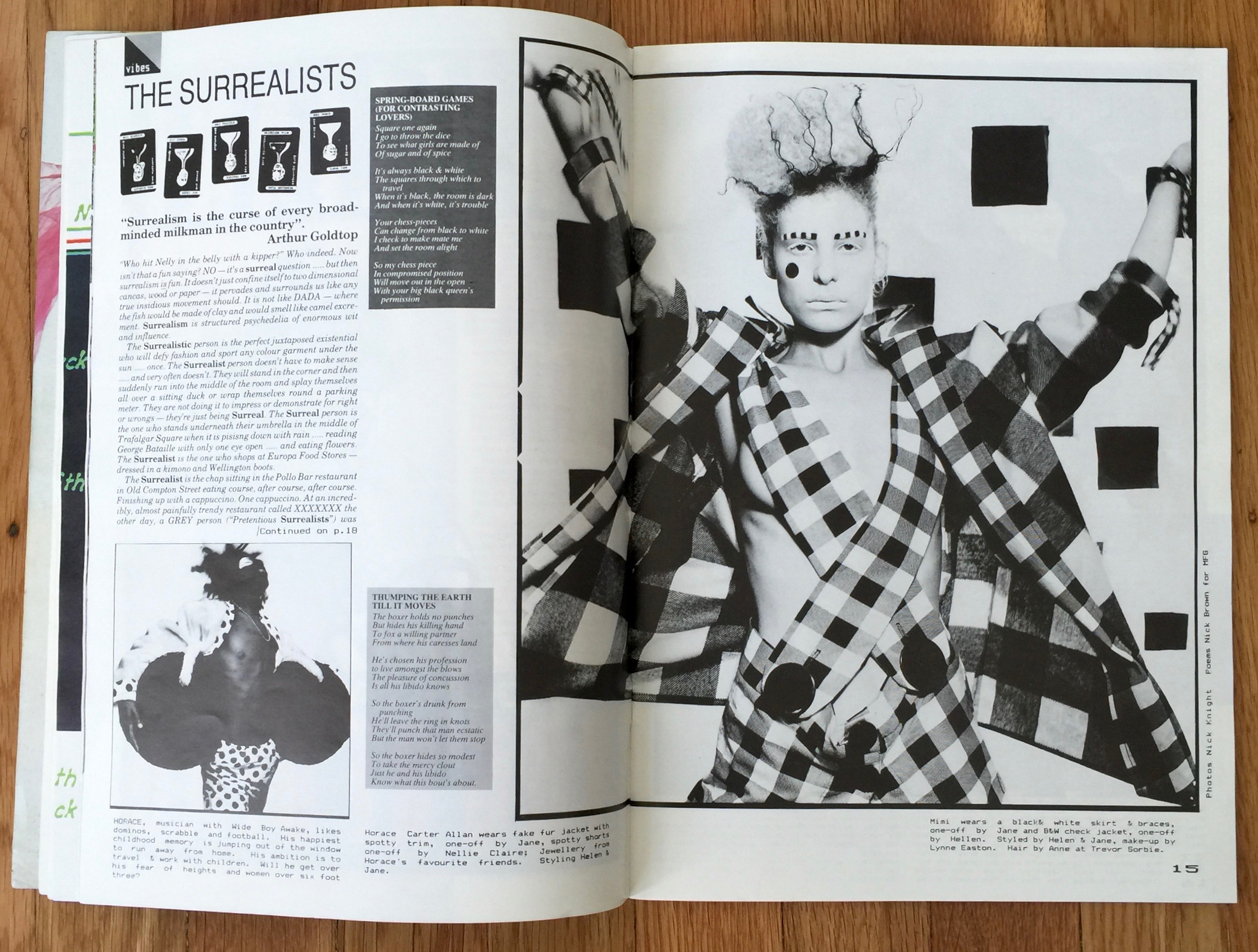
By 1983 the magazine had been going for 3 years and issue 13 in March was the '3rd Anniversary Issue' or the Wet 'n' Wild issue. By then the magazine was beginning to change, it's still under the editorship of Terry Jones but you can see now the have a little more cash - they get bigger ads and colour!
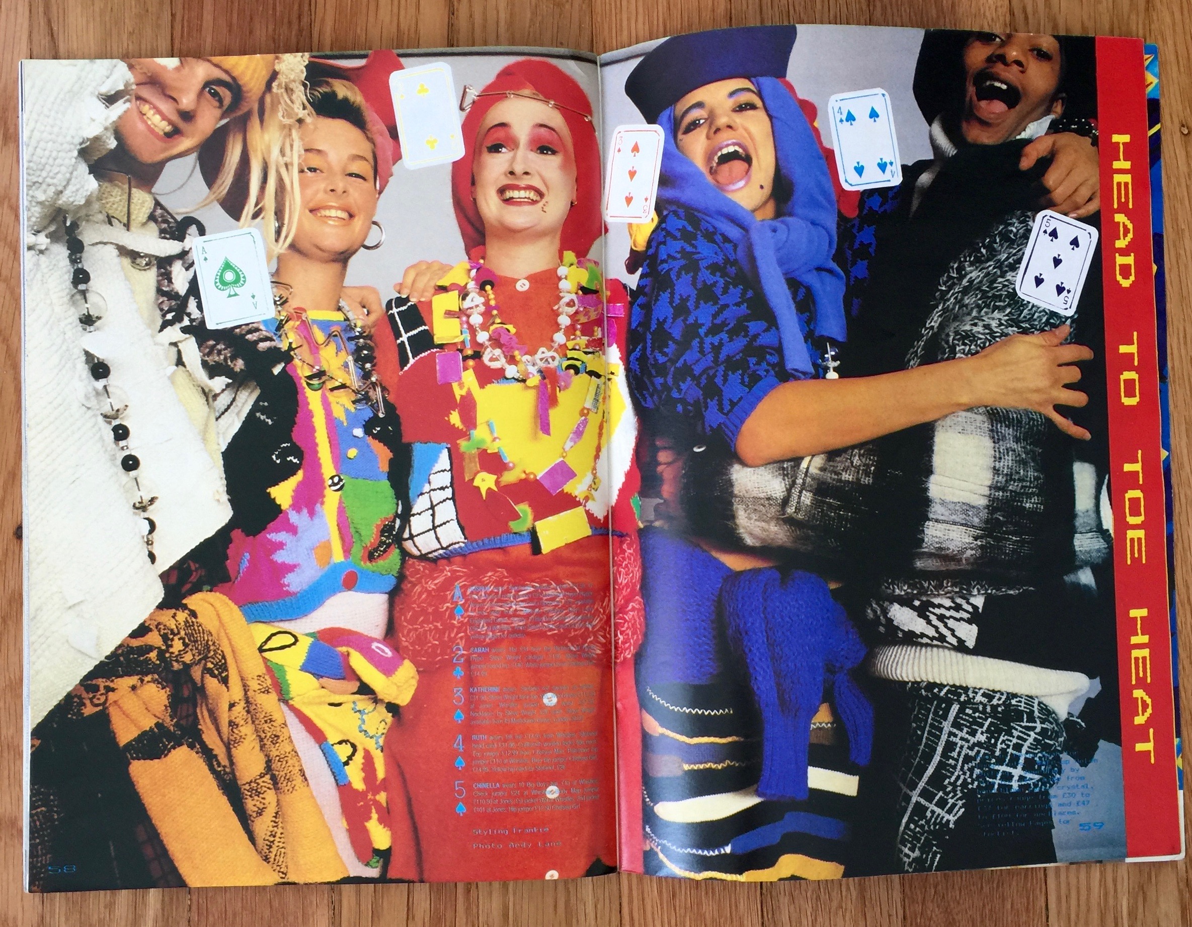
By the time we get to issue 18 in September 1984, it's a fashion mag. No longer using the landscape format or the fanzine style production and cut-up design, it's the real deal. That's not to say it doesn't retain it's edginess or integrity, it's still challenging and has plenty of the punk attitude it started with.
And here are some of the ads. At the time I-D demanded that your ad 'worked' for their magazine. So even fairly straight brands did some pretty cool work.
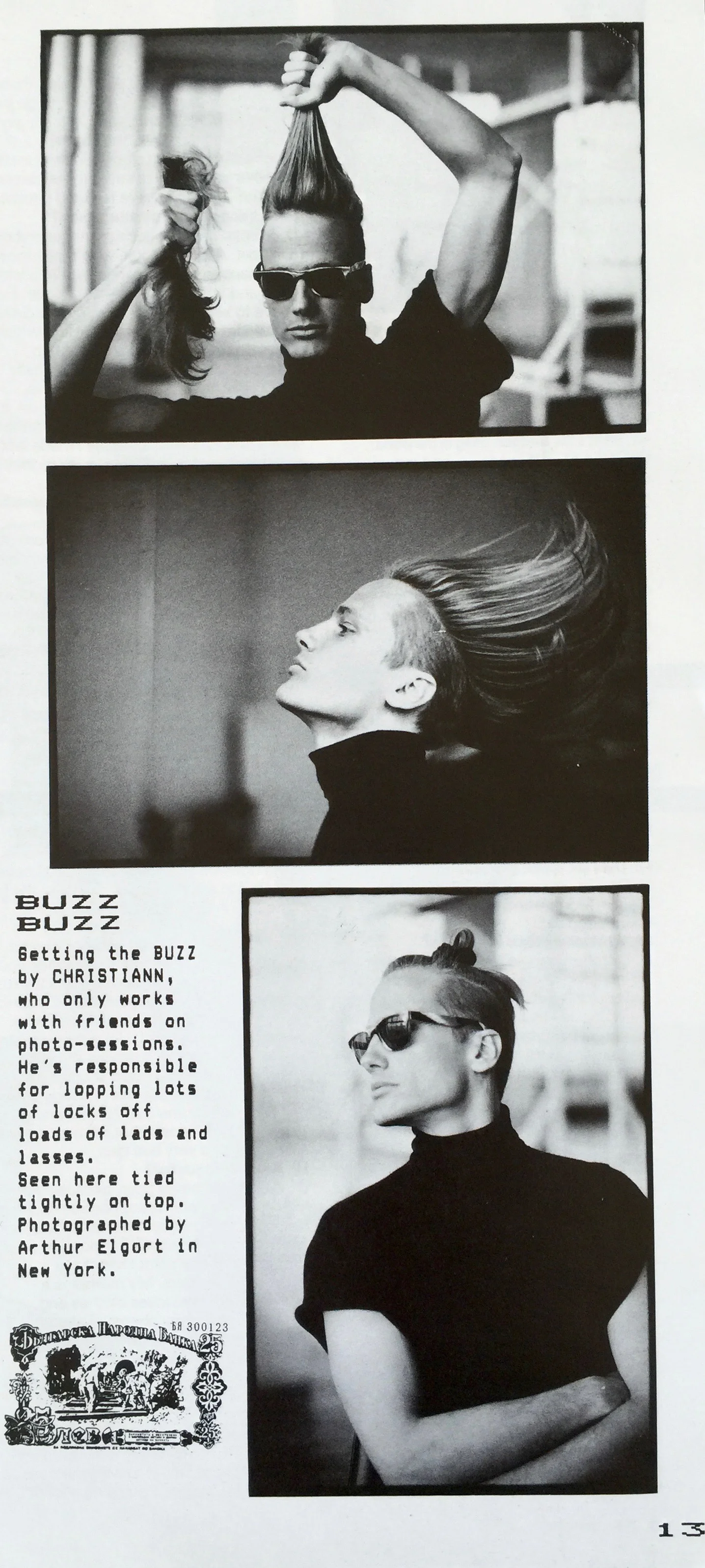
And finally for those top-knot wearing hipsters who think they are so cool and so original, here's a little reminder that your dad beat you to it.


