
My main blog (paperposts) is about paper, from the book to the package to the flyer, however it's books I love the most. It's mainly concerned with the 'object' not the content, it's the design of the thing. Like the character in Calvino's If on a Winters Night... who taught himself (the impossible) not to read, but only to 'see' the book as an object, a thing, with no meaning to be drawn from the glyphs on the pages. To make up for that absence of 'content' here's a list of 10 books, in no particular order, whose contents have influenced, inspired or otherwise resonated with me over the years. Some are purely visual, others a little deeper, but they all left their mark.

Design for the Real World - Victor Papanek
This was the first book to shake my world and help me understand my responsibilities as a designer. It planted the seed that became my design ethics and it awakened the politicised designer in me. At the time I was a naive young graphic designer student (fresh from school), and although he was tackling big design problems to help humanity, such as redesigning the plough, I saw how as any designer you have responsibilities. You make things that effect people, thus you must be aware of the implications of your work, it's not just about you and your client. Much later I discovered Milton Glaser's 12 steps to hell and the First Things First Manifesto, which cemented this notion for me. I think this book, more than any on the list set me on the path to where I am now.


The Medium is the Massage - Marshall McLuhan
and I Seem to be a Verb - R. Buckminster Fuller
These 60's paperbacks are classics and were introduced to me by my undergrad lecturer Ian Noble (sadly no longer with us). My love of these goes beyond the pop cultural theory and sits squarely with the brilliant graphic design of Quentin Fiore. So I'm counting these as 1 book.
Seeing how these great thinkers could work with a designer to enrich an idea opened up a new sense of the value graphic design could bring to a project. It helped me see beyond the surface to how design amplifies the idea or thought.

Exercices de Style - Raymond Queneau
One of my favourite examples of OuLiPo (Ouvroir de littérature potentielle) with the added design skills of the great french graphic designer Robert Massin. It's the same story told masterfully by Queneau in 99 different ways, with the added bonus of also being told through series of illustrations in different styles.
The thing I find most inspiring about this is the sense of mediation, how a message can be influenced by the way it is communicated. It's way more than an academic exercise, but yet falls neatly within Queneau's description of Oulipians as 'rats who create the mazes from which we plan to escape'.

Don Quixote - Miguel de Cervantes Saavedra
Don Quixote is special on so many levels. From the giddying postmodernist self reference - referencing the first book (and alternative book) in the second, through to the suspicions cast on the translator in the opening pages. It's over 400 years old, but the story of someone consciously escaping the banality and emptiness of their time through fantasy is still prevalent today.
Whilst studying I used the text to explore many ideas. I read 'versions' and 'reimaginations' of the story such as Kathy Ackers Don Quixote. The idea of 'tilting at windmills' struck a deep cord with me, and became a key metaphor for my postgrad years. It was even the title for my masters thesis.

A Void - Georges Perec
This was the first OuLiPo book I read, and it's a masterpiece. It's a full novel without the use of the letter e. What's so amazing about this book is that although at first the flow and rhythm of the text is a little strange and awkward, you quickly adapt to it. I read the translation to English by Gilbert Adair which is possibly an even greater feat than the original by Perec.
What's so wonderful is how the 'constraint', the banned letter e is actually the catalyst for the creativity. It highlights how constraints can have a hugely positive impact on a creative endeavour. This idea is something that fits with every design brief I've ever had and should be embraced. Constraints focus you and instil discipline, they encourage creative thought. If there are no constraints upon a project, make up your own, it will be better with them than without them.

Species of Spaces and Other Pieces - Georges Perec
Early in my career I worked at Penguin Books. I'd just left college and was full of the oulipian ideas I'd just spent two years obsessing over. At Penguin I could hardly believe my luck when they published Species of Spaces as a 20th Century Classic.
I was their web designer and had to create a promotional site for the book. It was still early days for website design and I got to do pretty much whatever I wanted. I had a lot of fun, playing with knights tour for the navigation and peculiar layout. Total indulgence and barely usable - more art project than information design, it was truly in the spirit of OuLiPo.
I've reread the book many times and love it, so many ideas crammed into the pages. Wonderful.
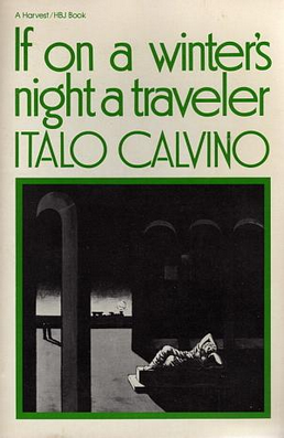
If on a Winter's Night a Traveller... - Italo Calvino
This is the never ending book. It's the story of a reader and their quest to read the next chapter of the book they start, thus every next chapter extends this book. It opened my eyes to how context can stitch together seemingly separate things, albeit with the guiding hand of an expert storyteller.
I think it also awakened a tendency for apophenia in me that I've never shook off. That sense that there are connecting patterns everywhere and by simply changing the way you approach something you can uncover whole new ways of understanding it.

Labyrinths - Jorge Luis Borges
This book is an explosion of ideas. So many of the pieces it contains are conceptual kick starters for thinking about the digital world. The ideas maybe big but the writing is accessible and eloquent, grounded by perfectly formed narratives and expert storytelling. If you have anything to do with information design or UX and haven't read this, go get a copy now. It's worth it for these 3 pieces alone:
- The Garden of Forking Paths
- The Library of Babel
- Kafka and his Precurors

An Endless Adventure - Iwona Blazwick
Great catalogue of Situationist artefacts, but it's the sandpaper cover that nails it for me as it violates the other books on the shelf - perfect design for subject. This is from my more politicised student days when I was experimenting heavily with how design and far left ideas could work together. It's a great catalogue from the ICA exhibition and covers the movements early days through to the influences it had on Punk and beyond.
The L’Internationale situationniste are full of challenging ideas and fabulously disruptive and unapologetic, just what an angry young man needed. Their are two ideas that have stuck with me and are still relevant today. Firstly, dérive (more here), this is closely linked to psychogeography and is about resisting the physical flow of a city to follow the different 'ambiances', thus forcing new possibilities - similar to Baudelaire's flaneur but way more edgy. Secondly there's détournement (more here), this is the extremely fun game of taking an existing piece of media and subverting it with subtle changes, to say something else, generally something opposing.

In Praise of Shadows - Junichiro Tanizaki
It's a deep exploration of the Japanese traditional aesthetic. If you've read wabi sabi for designers, you'll love this. It's essentially about subtlety, and the richness, beauty and depth of partially hidden things. How by understanding the counterparts (light and darkness) and how they work together, you can create deeper experiences.
It's a beautifully poetical book, far more than just another tool for designers arsenal.
There you are, 10 (or 11) books that left their mark on me. Of course there are more than this, and far more that I've simply enjoyed. I'm not saying go out and read these books, rather that each of them found me at the right time. For one reason or another I was open and receptive to them. The context was right. My experience of them is exactly that, mine. Yours will be different, after all... what comes to be read is awakened in the moment of reading.
